Atlanta Airport App Interface
OBJECTIVE
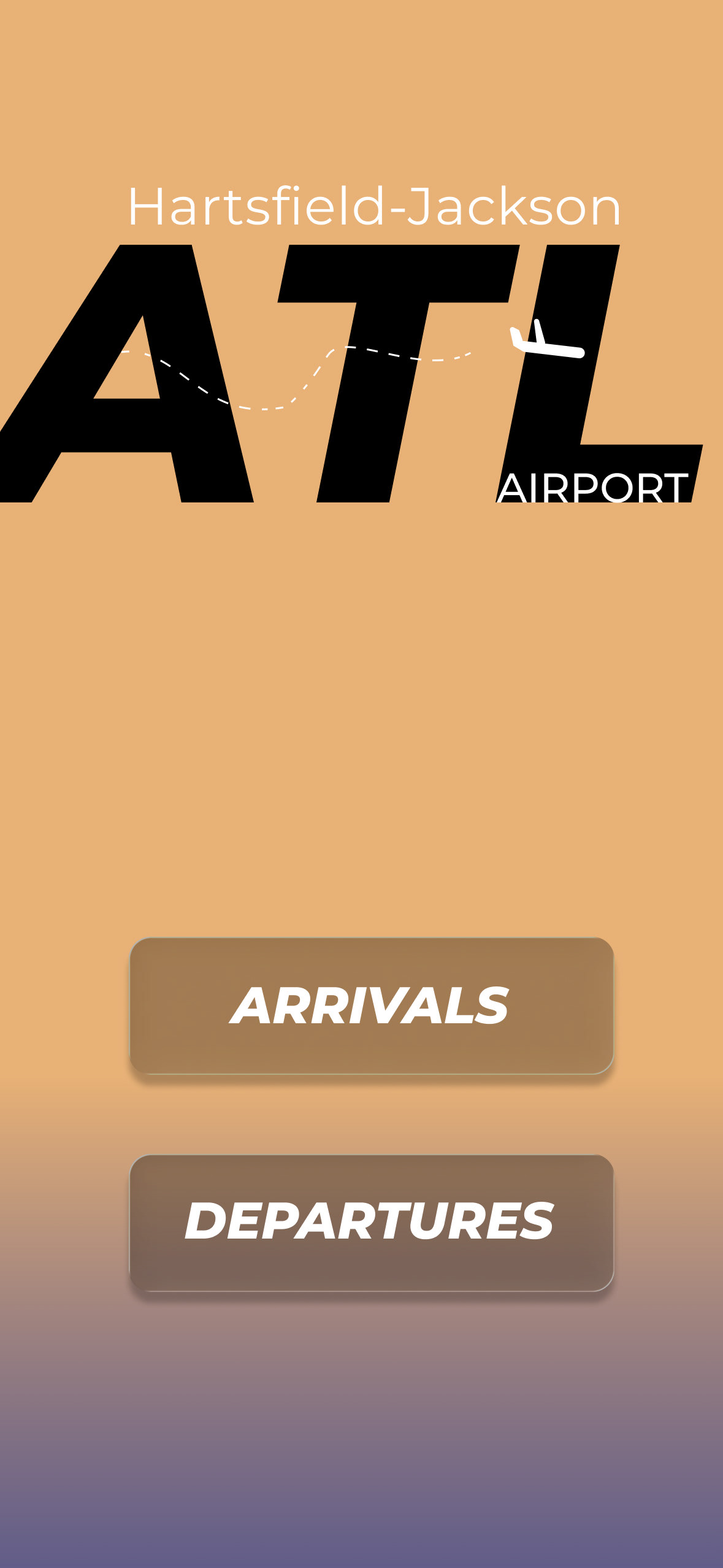
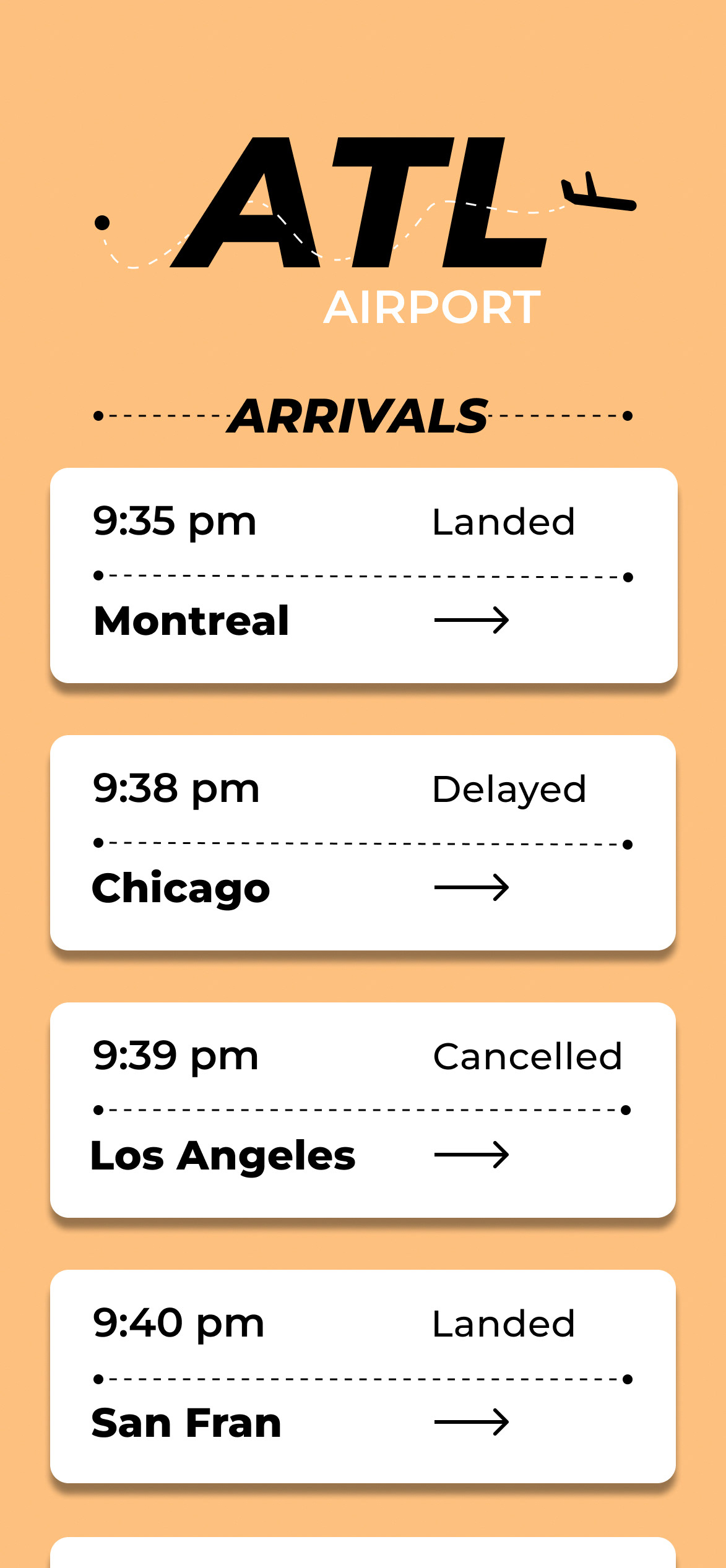
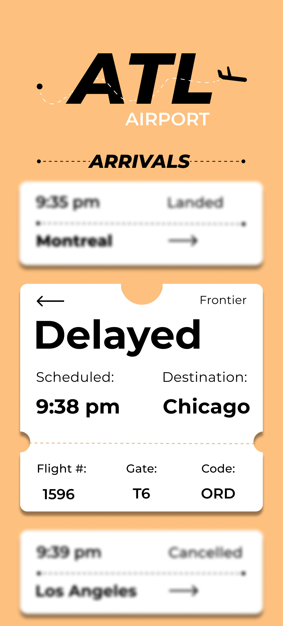
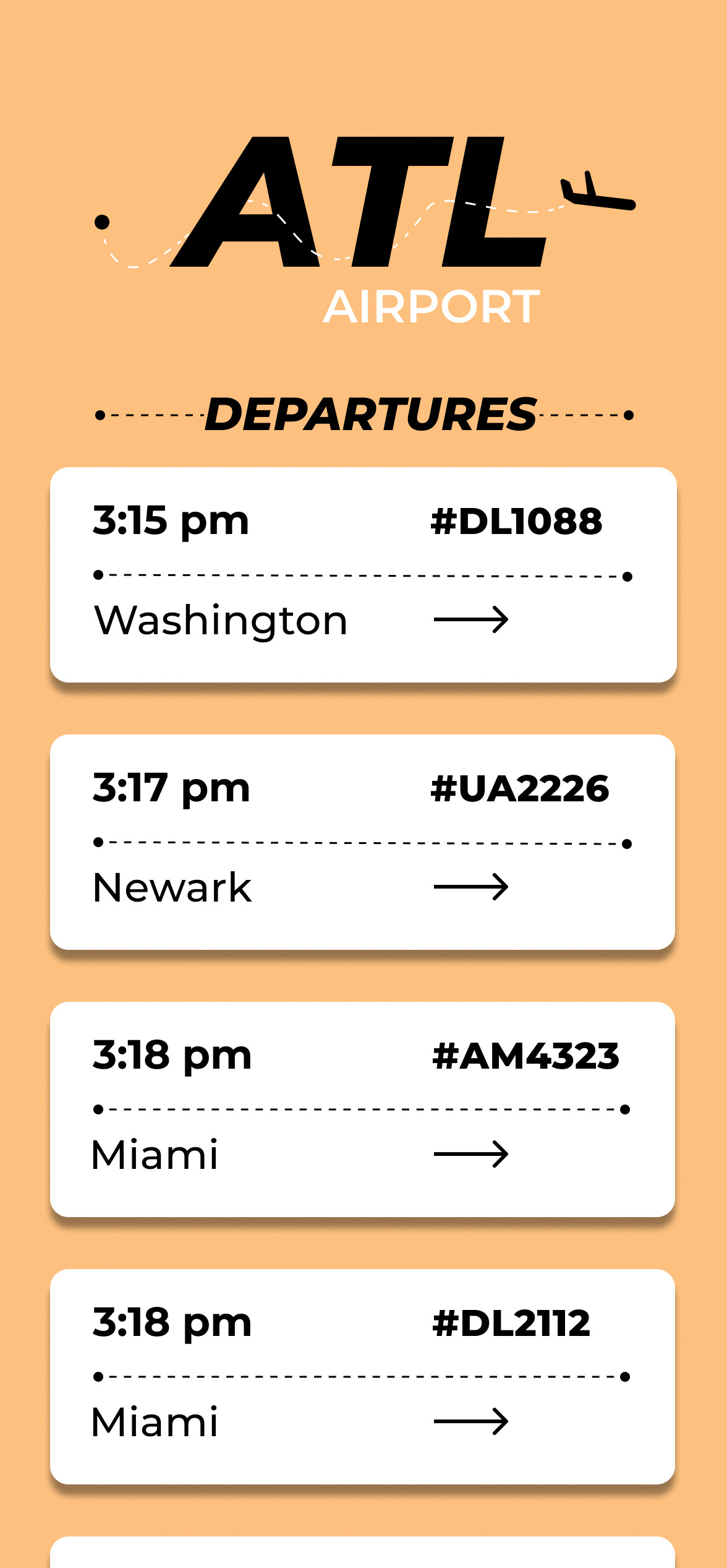
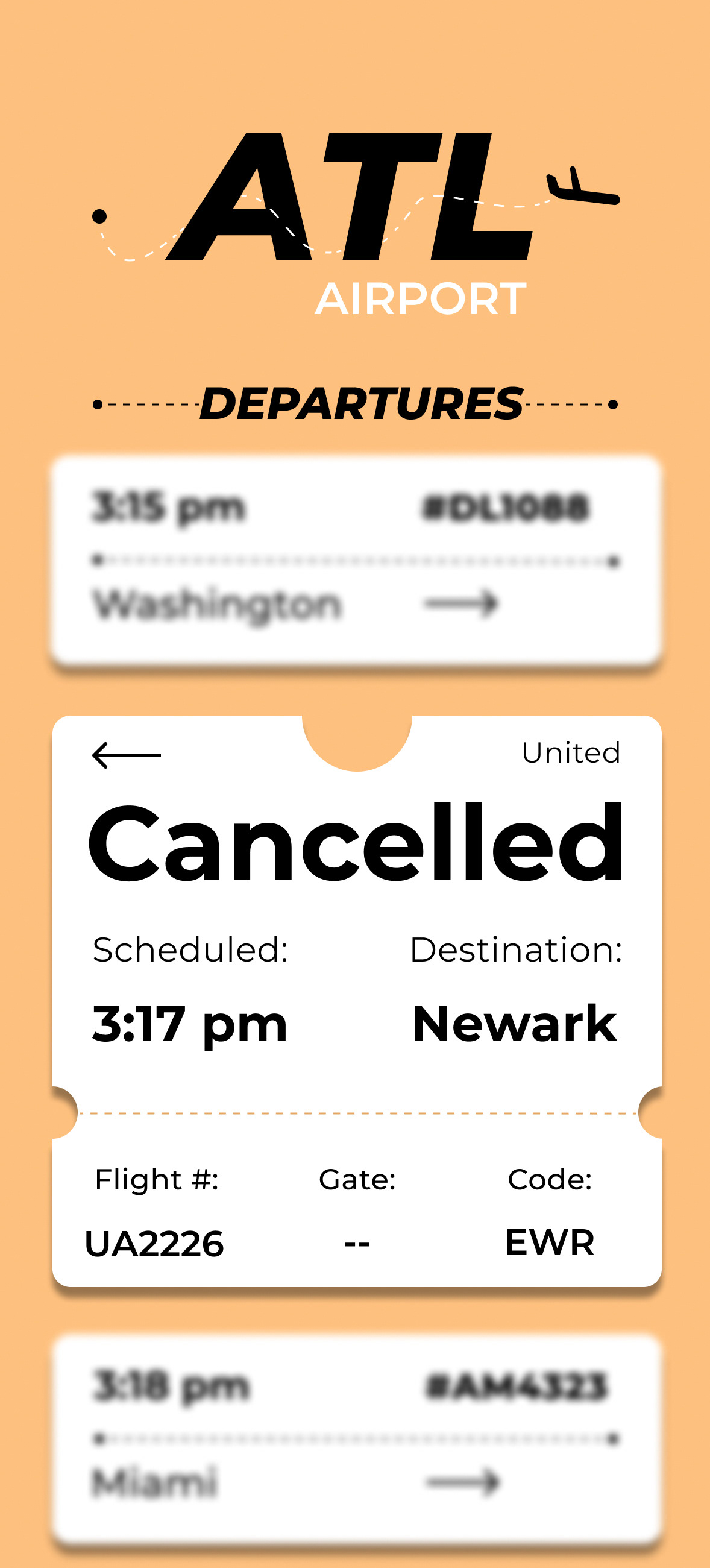
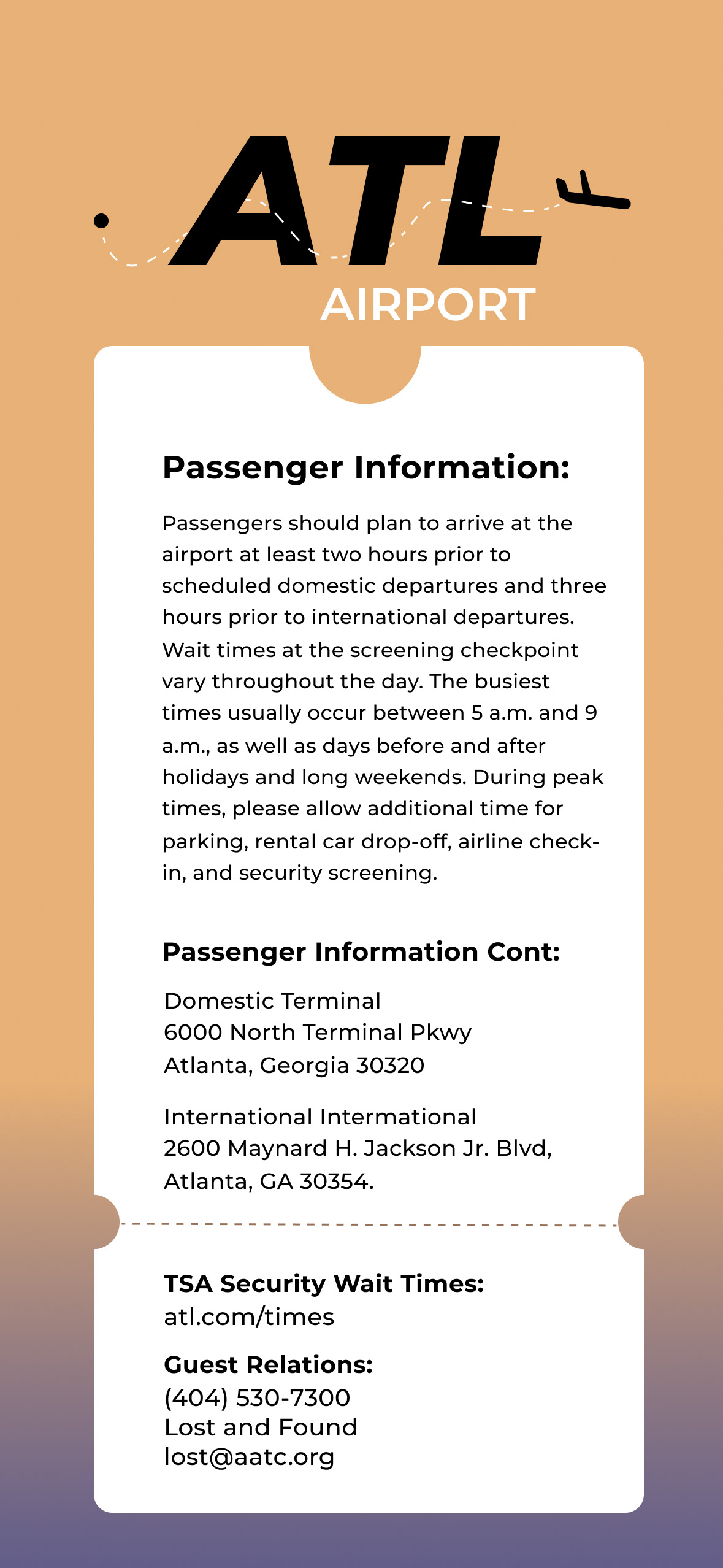
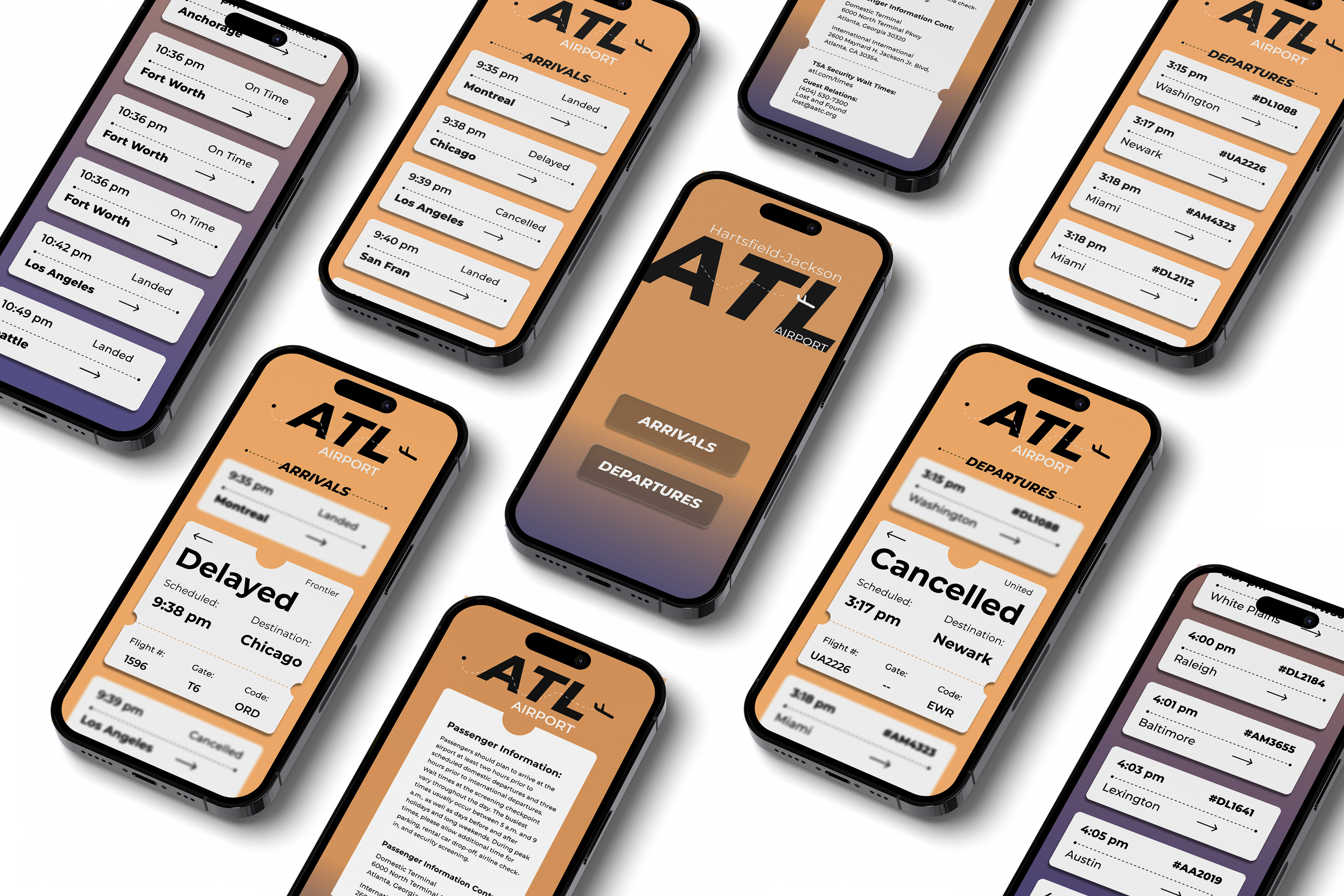
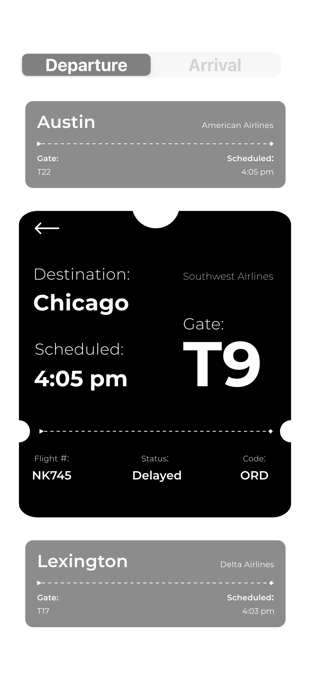
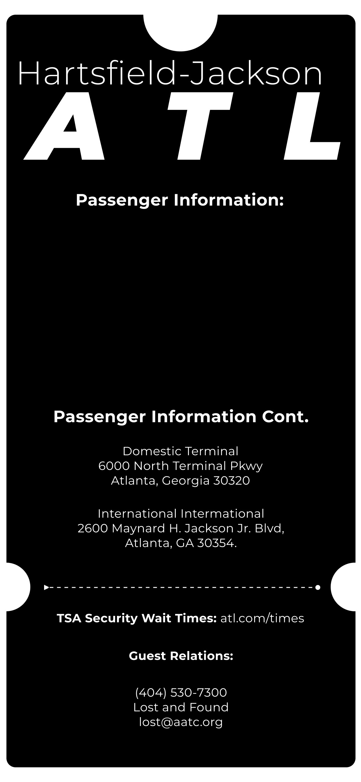
This project focuses on designing a mobile flight information display system (FIDS) that organizes complex flight data into a clear and readable typographic hierarchy, presented on a IPhone 14/15 pro. The project prioritizes using grids, tabular typography, and visually appealing organization to help the audience quickly find essential flight information.
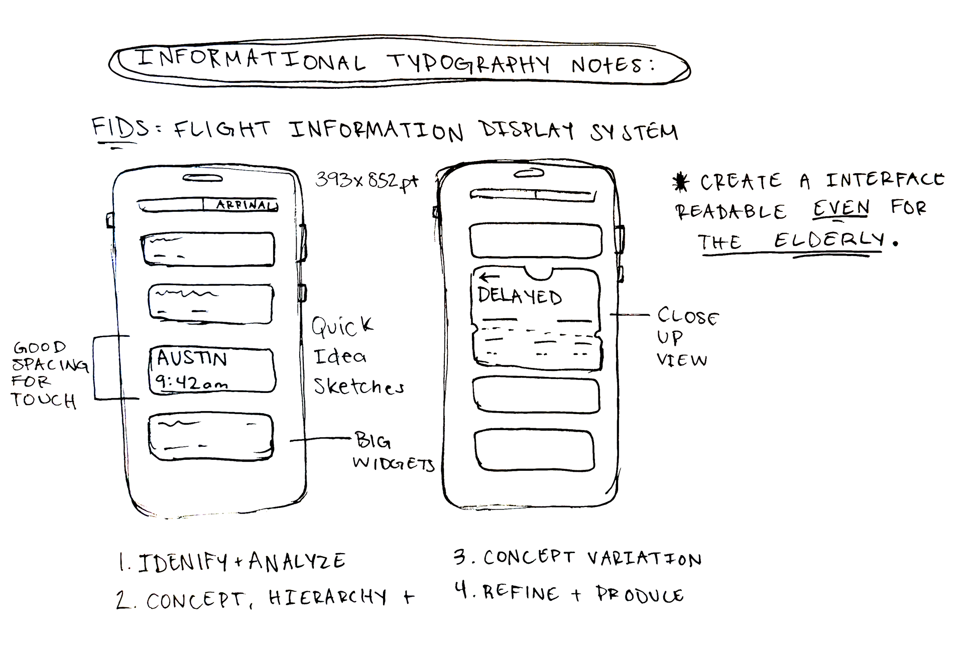
Sketches + Brainstorm
I began by sketching and brainstorming different ways to express a readable, organized manner of the flight information provided. These early studies helped me explore possible layouts, hierarchy, and ways to make the information quick and easy to navigate.
Exploration
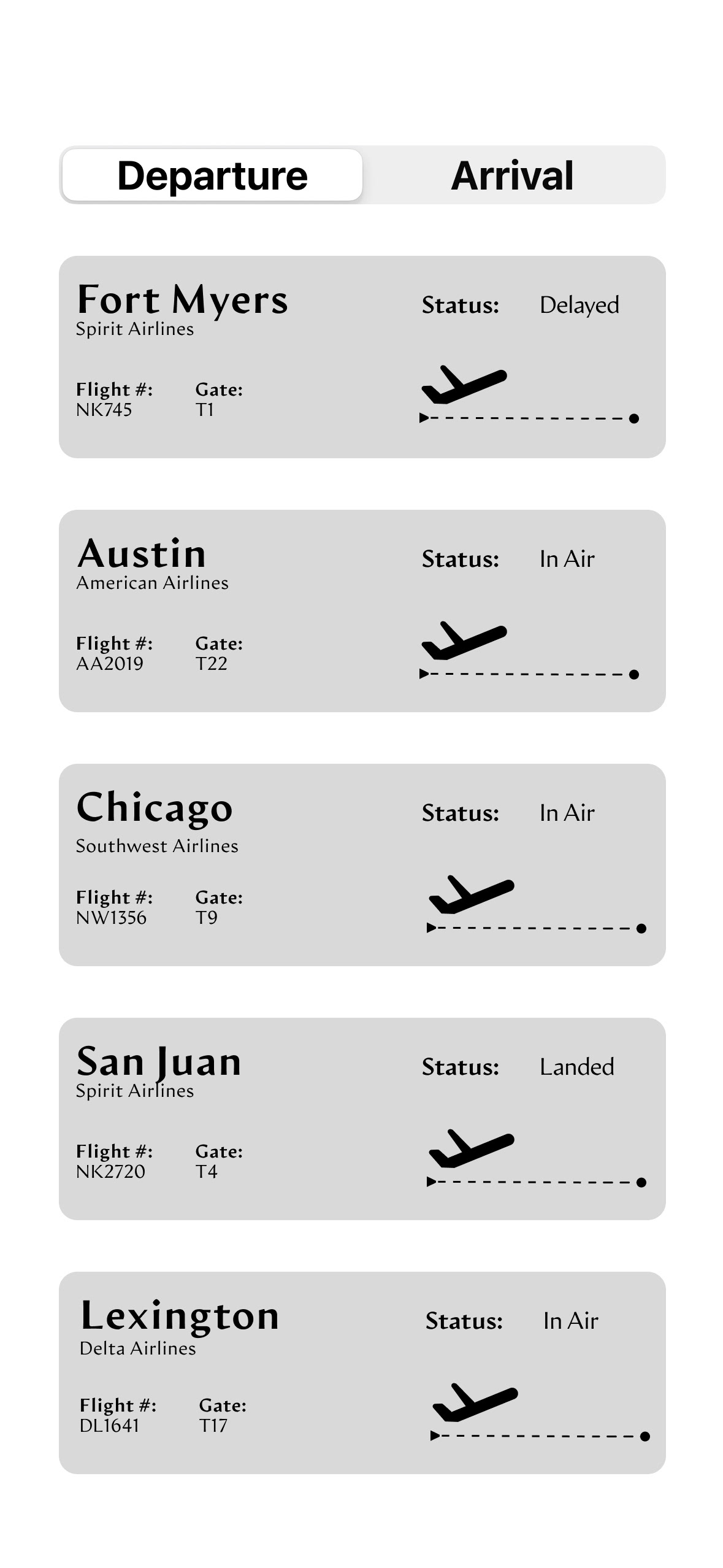
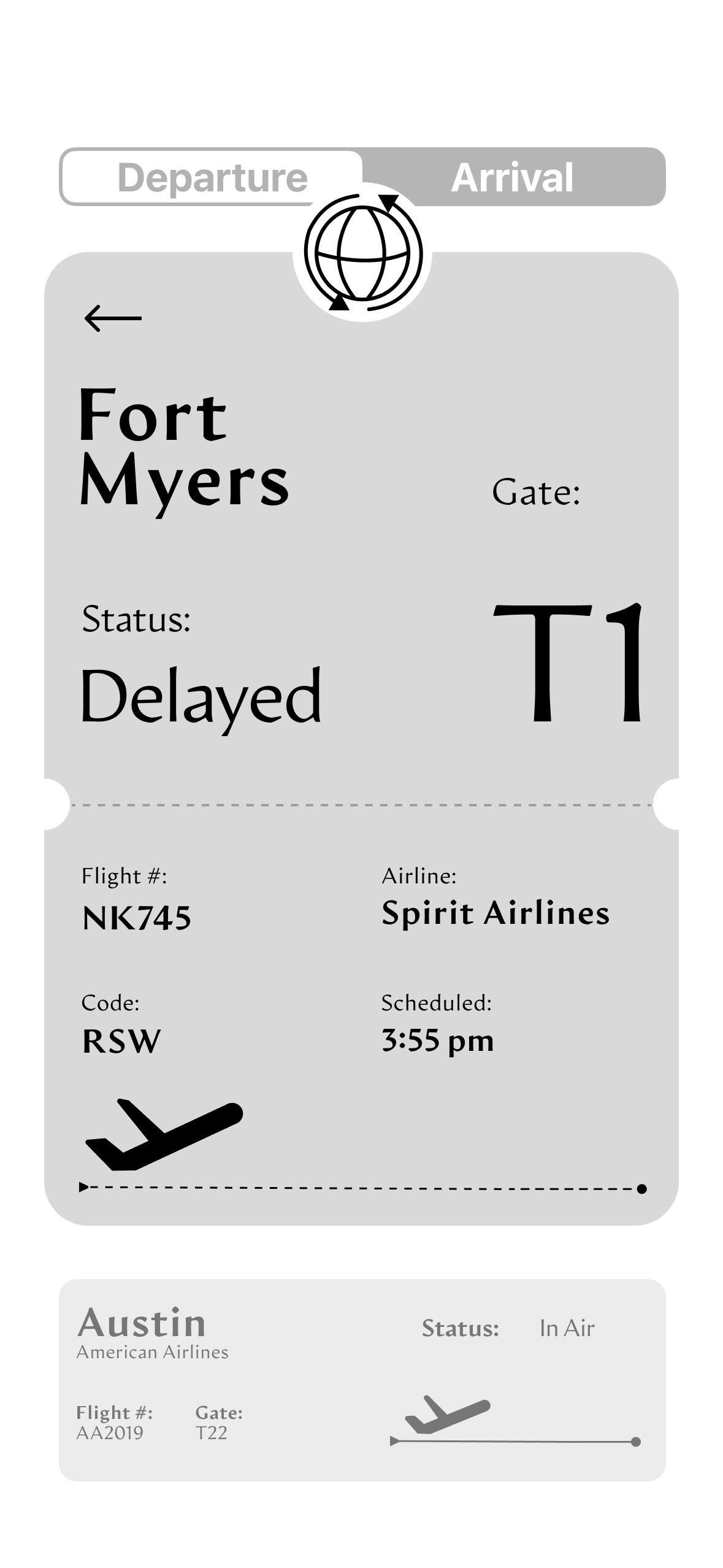
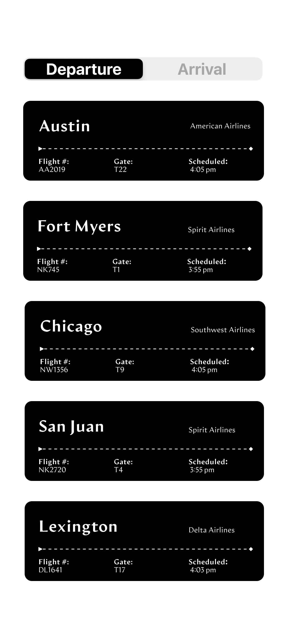
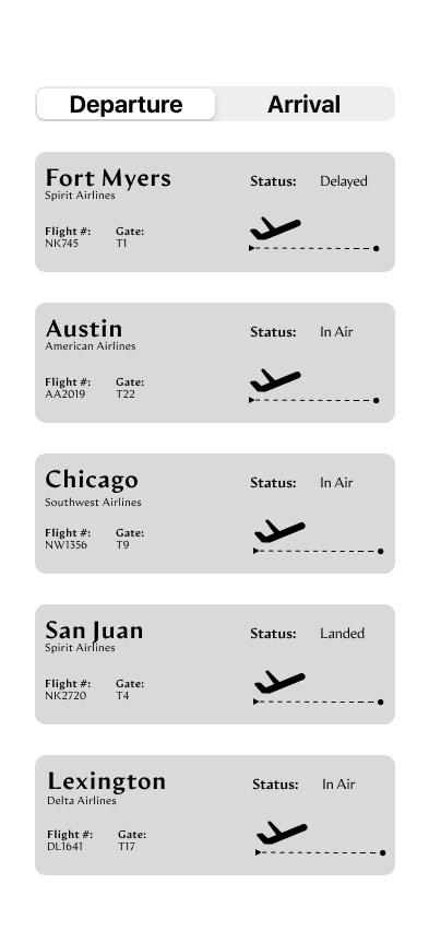
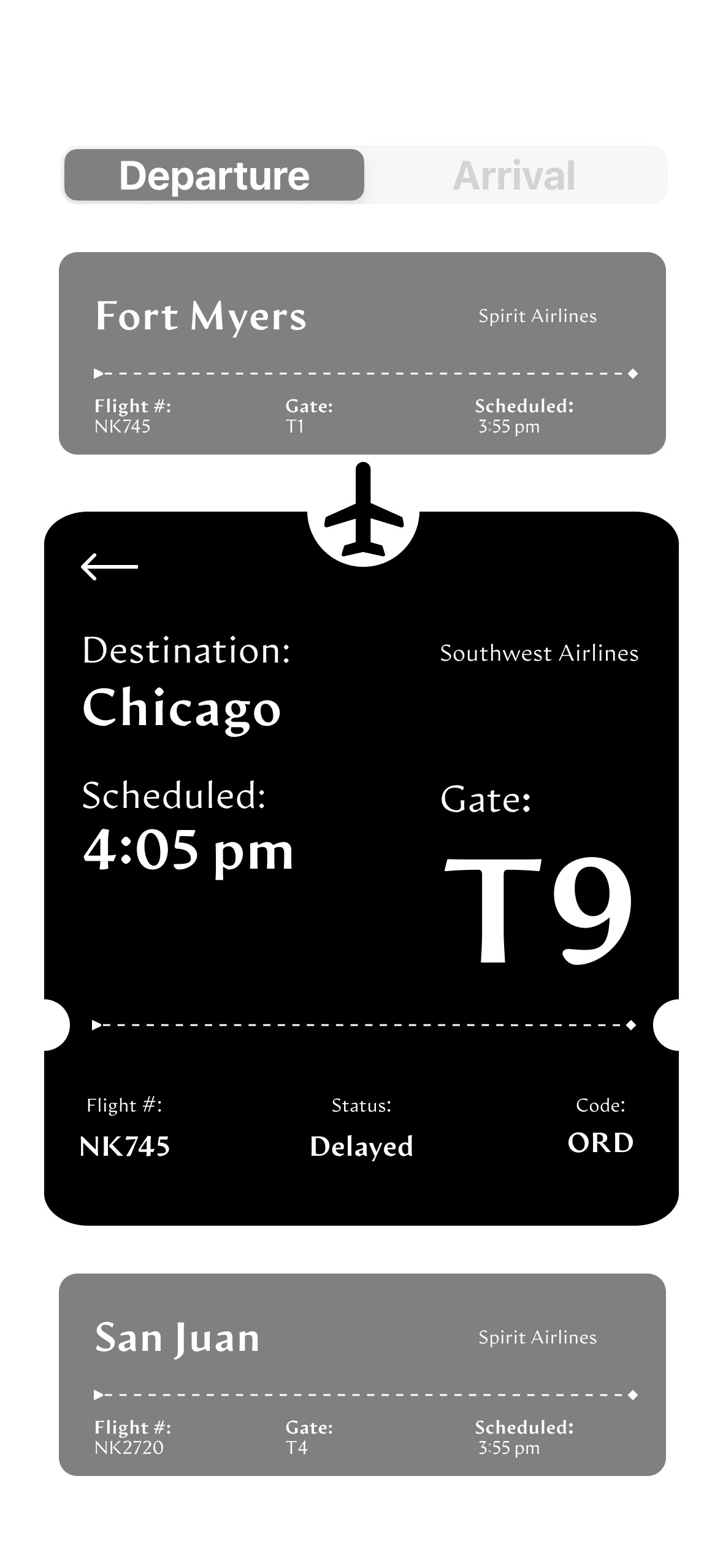
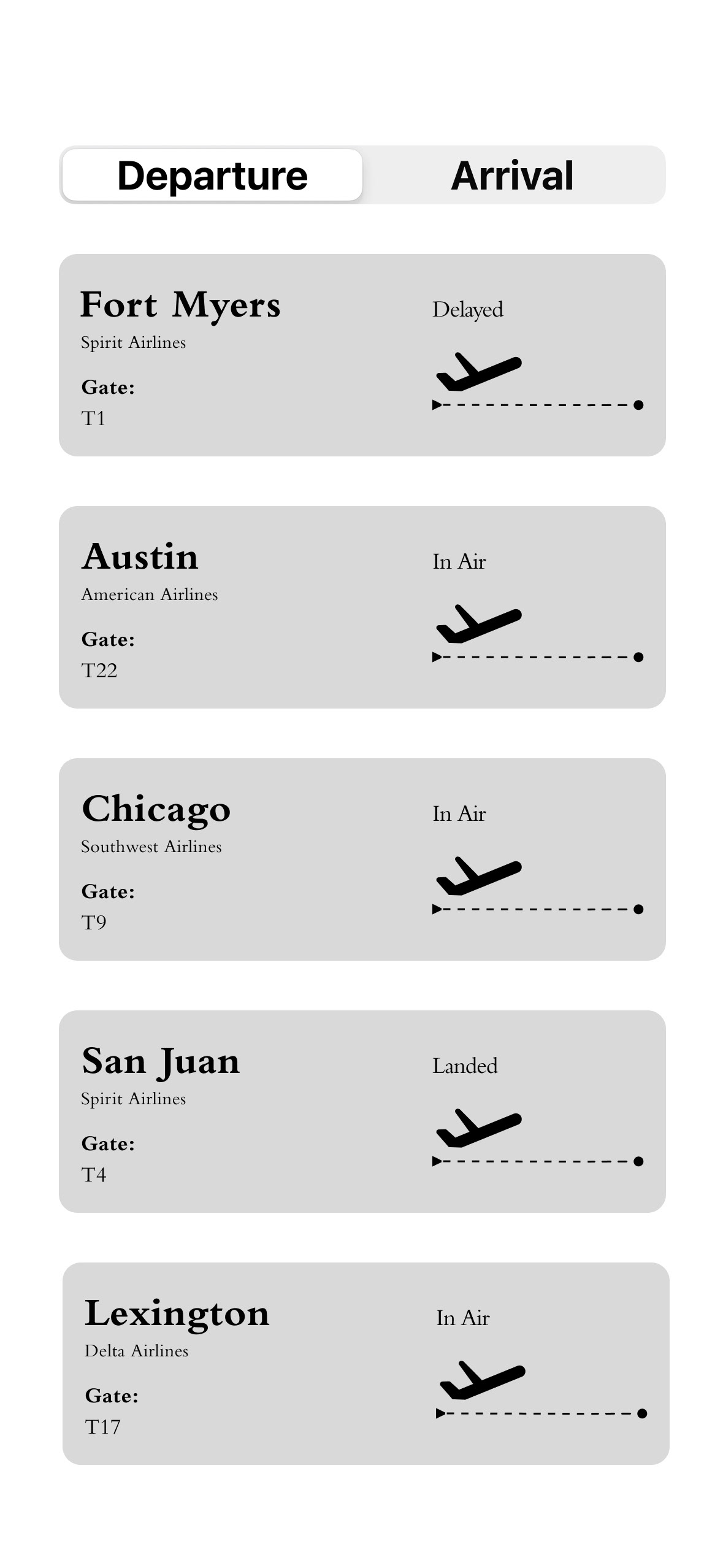
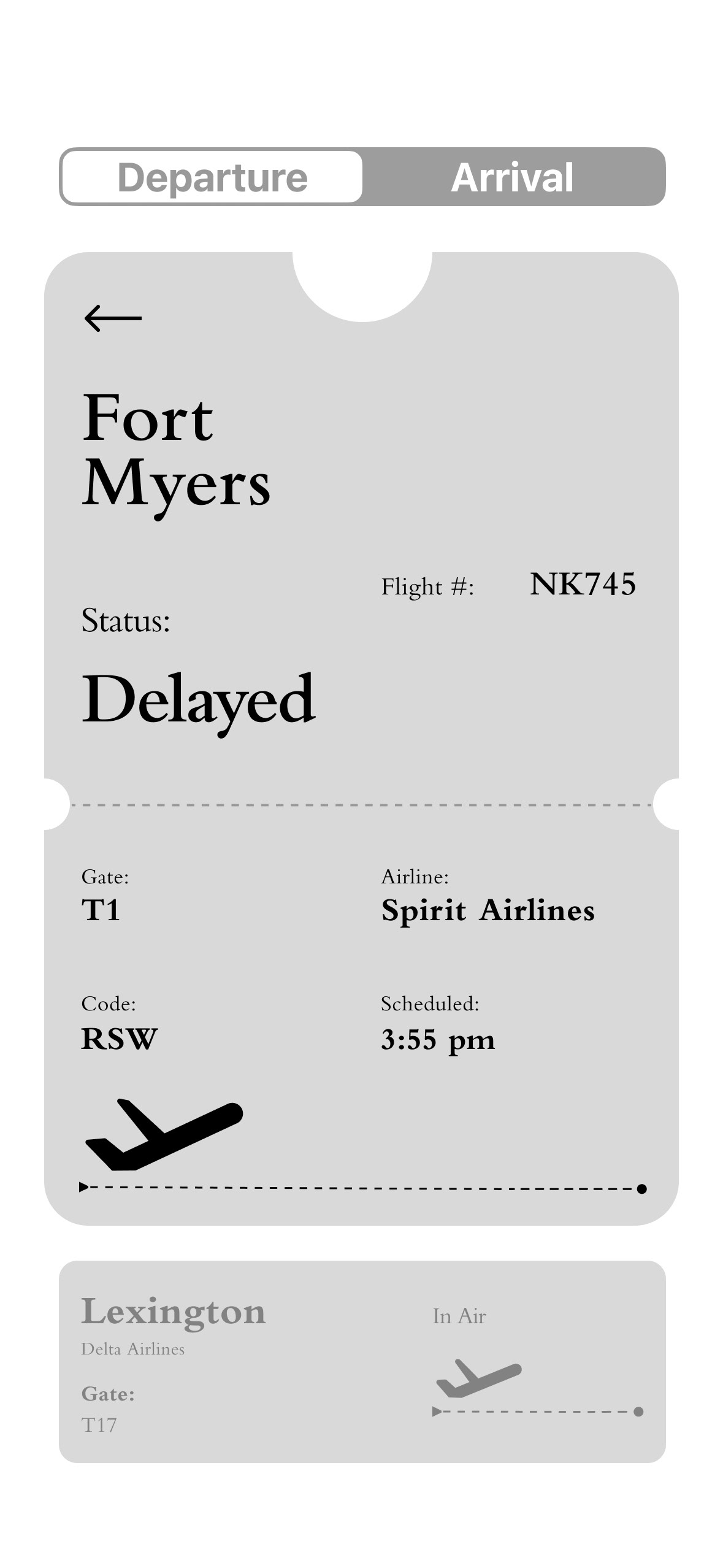
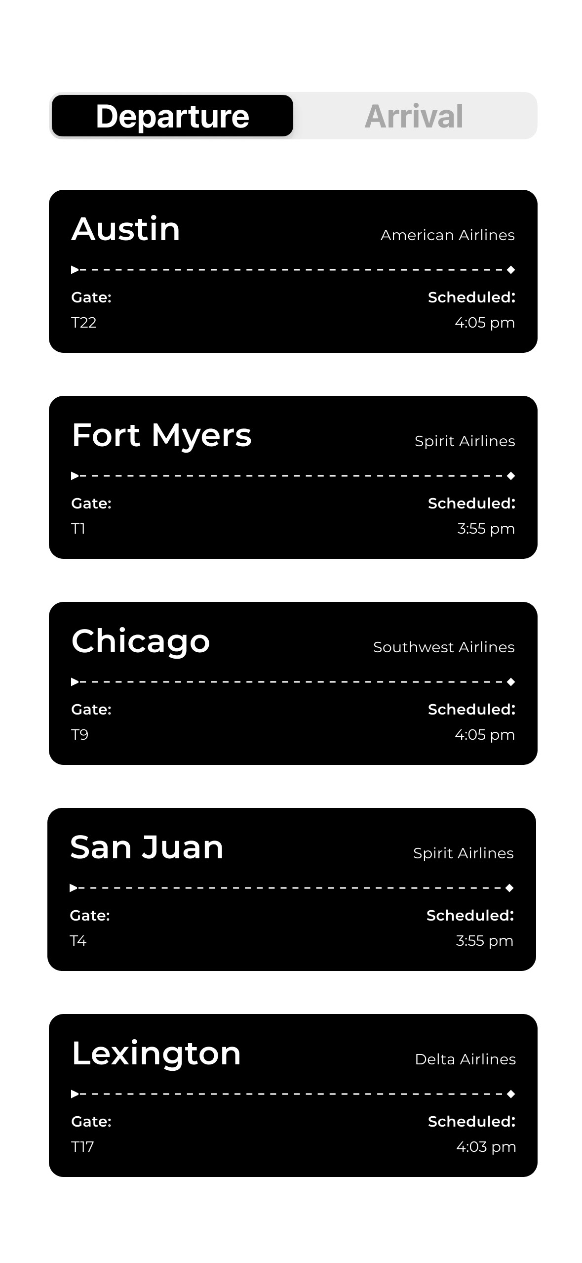
At the beginning of exploration, shown in my iterations is a large focus facing the aesthetic quality of each interface. As I developed and learned through each iteration, I shifted my focus to creating a successful readable and functionable interface, reducing clutter and simplifying the layout.
Color + Typography
For the typography, I chose Montserrat because its clean, modern, and legible design makes it a powerful fit for displaying complex flight information. It's simple sans-serif style helps keep the interface organized and allows users to quickly scan and find important details, without confusion.

With my choice in color, I decided to keep the text in neutral colors to maintain readability and avoid distracting from important flight information. I used varying style weights to create a clear hierarchy, allowing users to quickly see most important details. While, the gradient background adds color and visual interest while keeping the interface clean and organized.
I chose the sunset gradient to add warmth and visual interest while connecting the design to the feeling of flying.

Final Interface Design
After consistent iteration to improve usability, clarity, and visual hierarchy, I am content with the user-friendly airport app interface I have designed, while maintaining a clean, cohesive aesthetic.