Typographic Poster

Objective
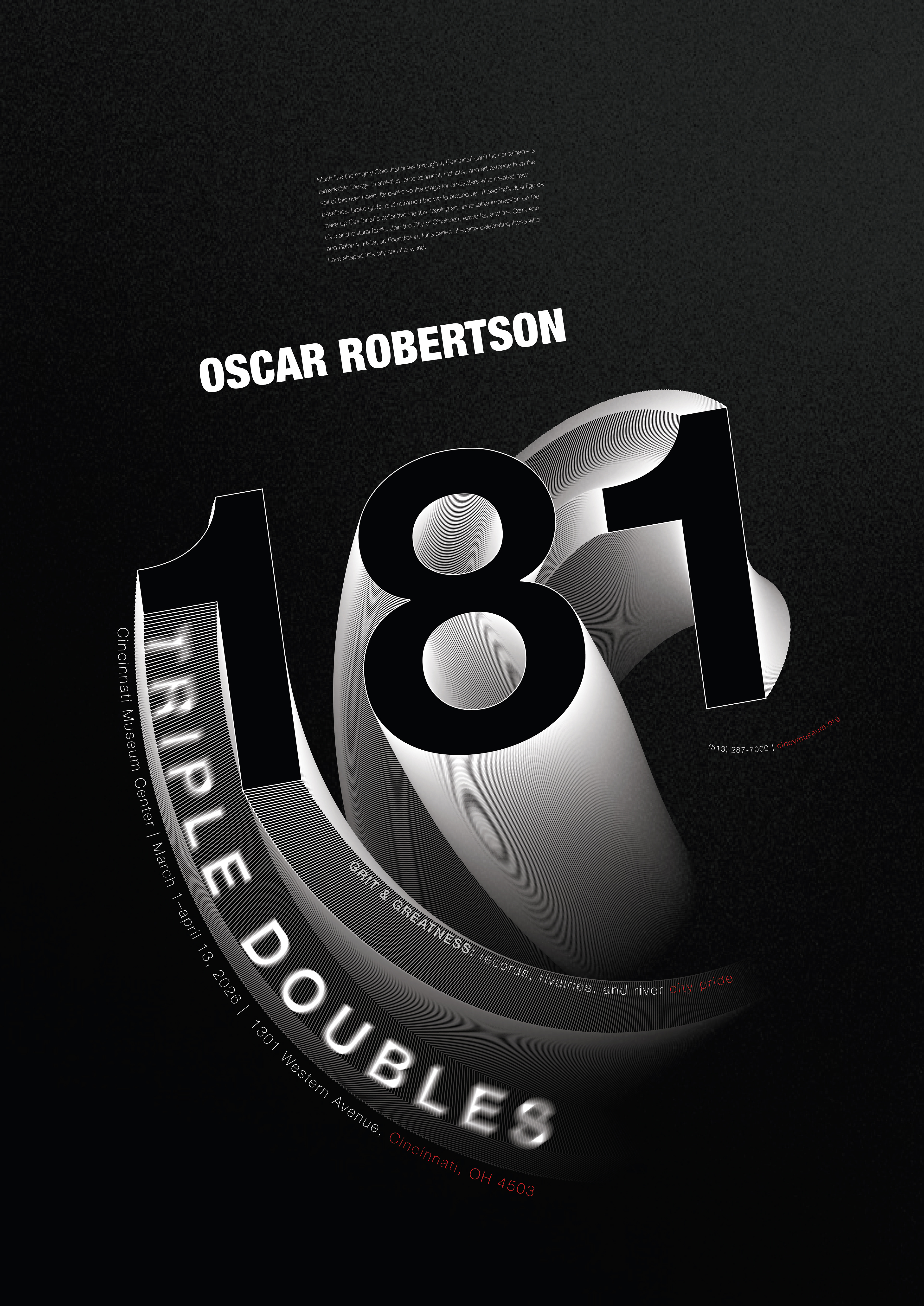
This project focuses on Creating a typographic poster that visually communicates the contributions of a person’s work while establishing a clear hierarchy and engaging visual system.
Person Chosen: Oscar Robertson
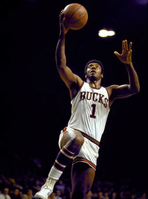
After conducting research, I learned Oscar Robertson was one of basketball’s most influential players, known for his all-around technique, becoming the first player to average a triple-double for an entire season. Robertson was a Cincinnati native, playing college basketball at the University of Cincinnati, where he began gaining a great deal of attention.
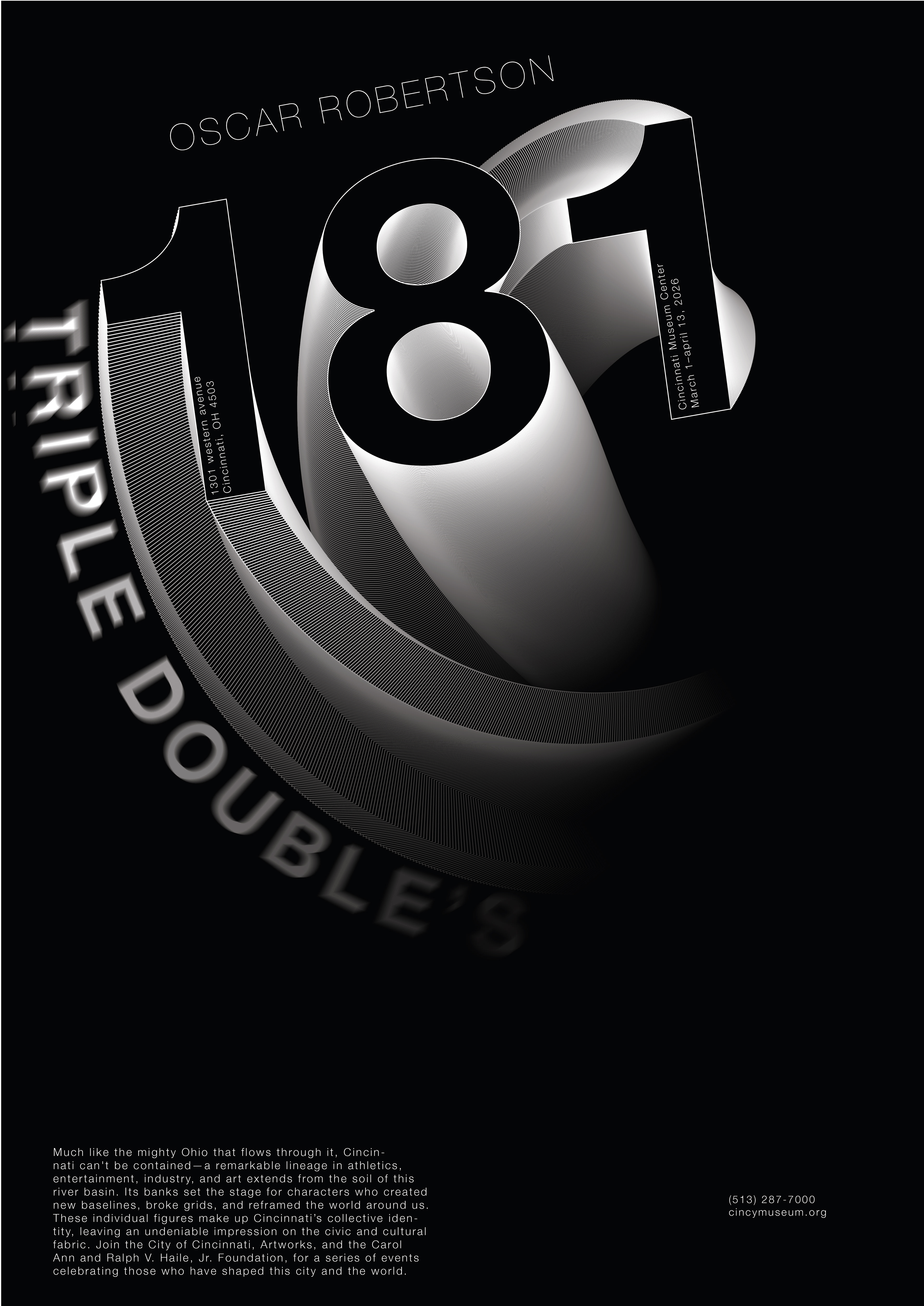
Through my compositions, I want to capture motion and energy while highlighting the 181 triple-doubles that defined Oscar Robertson’s career.
Exploration
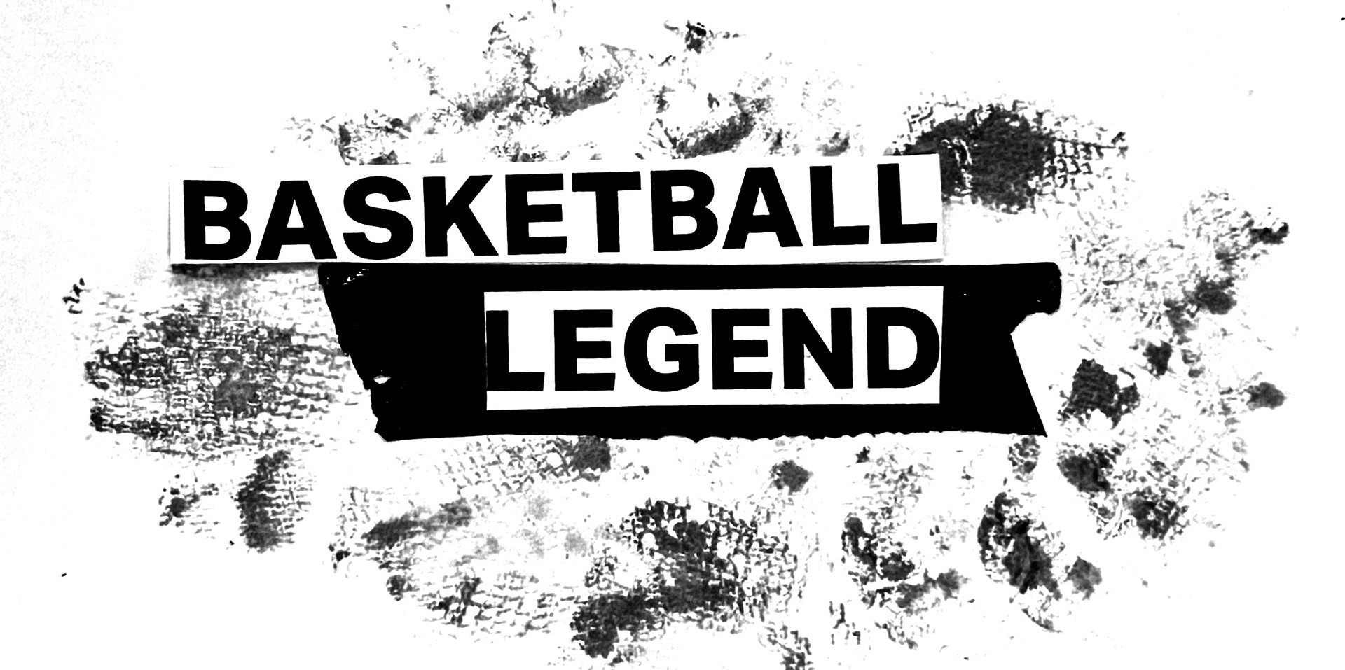
The images below show physical exploratory studies used to experiment with different concepts and compositions before translating them into digital designs.

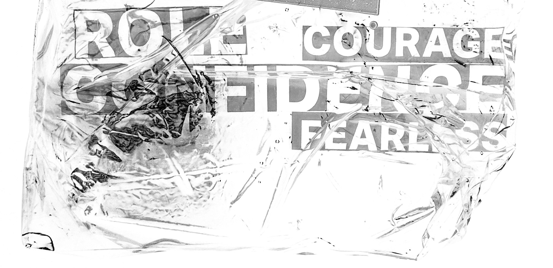
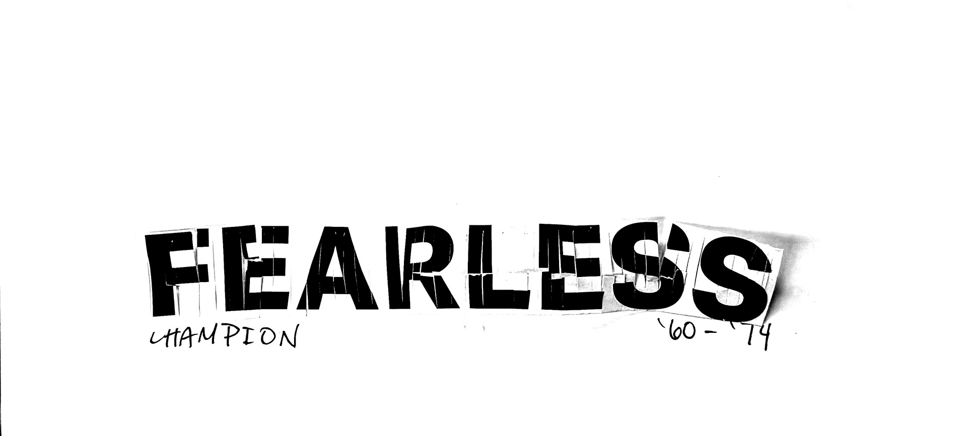
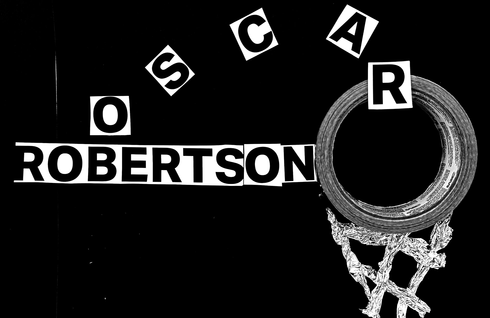


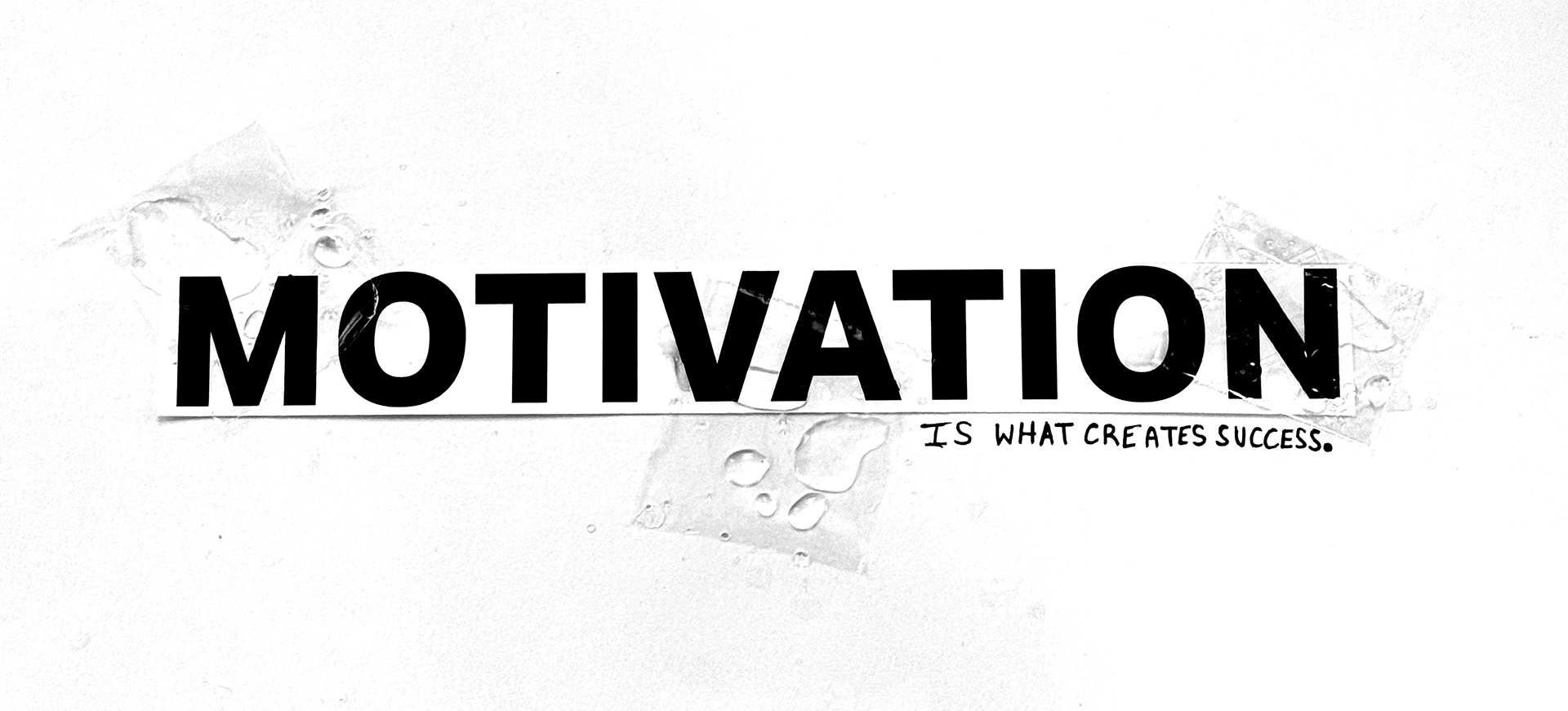
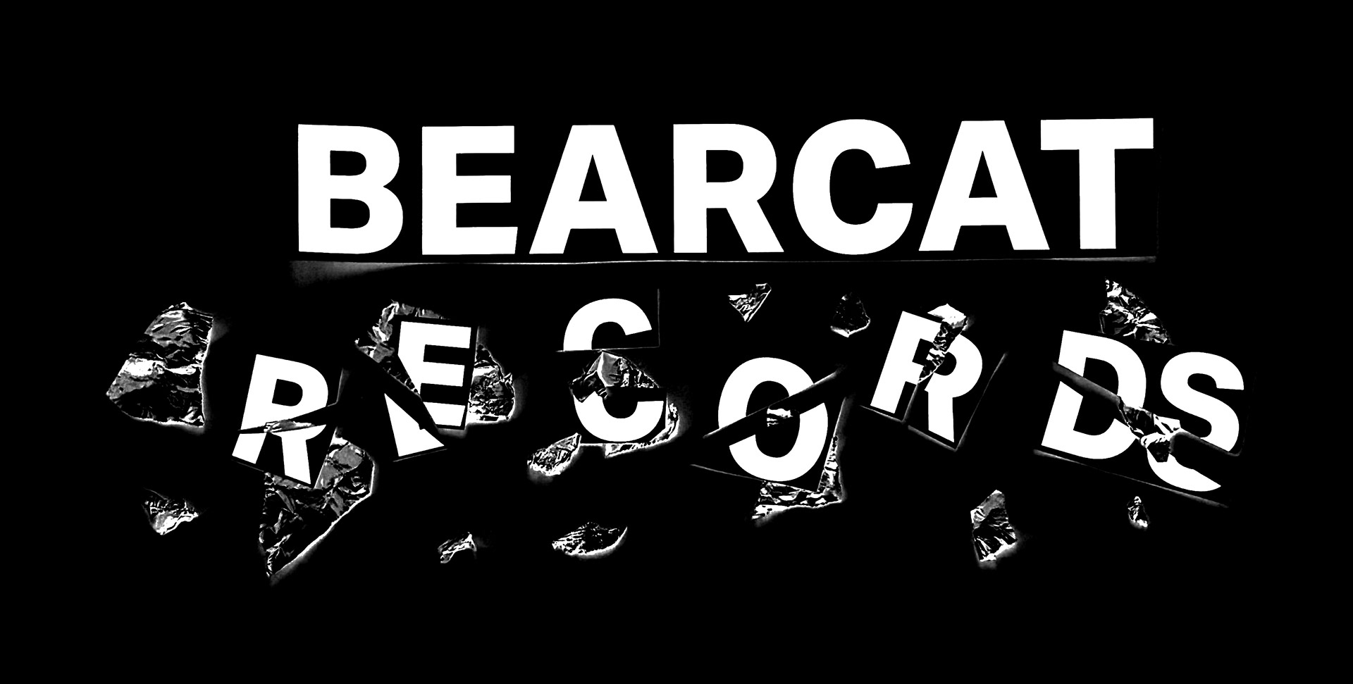


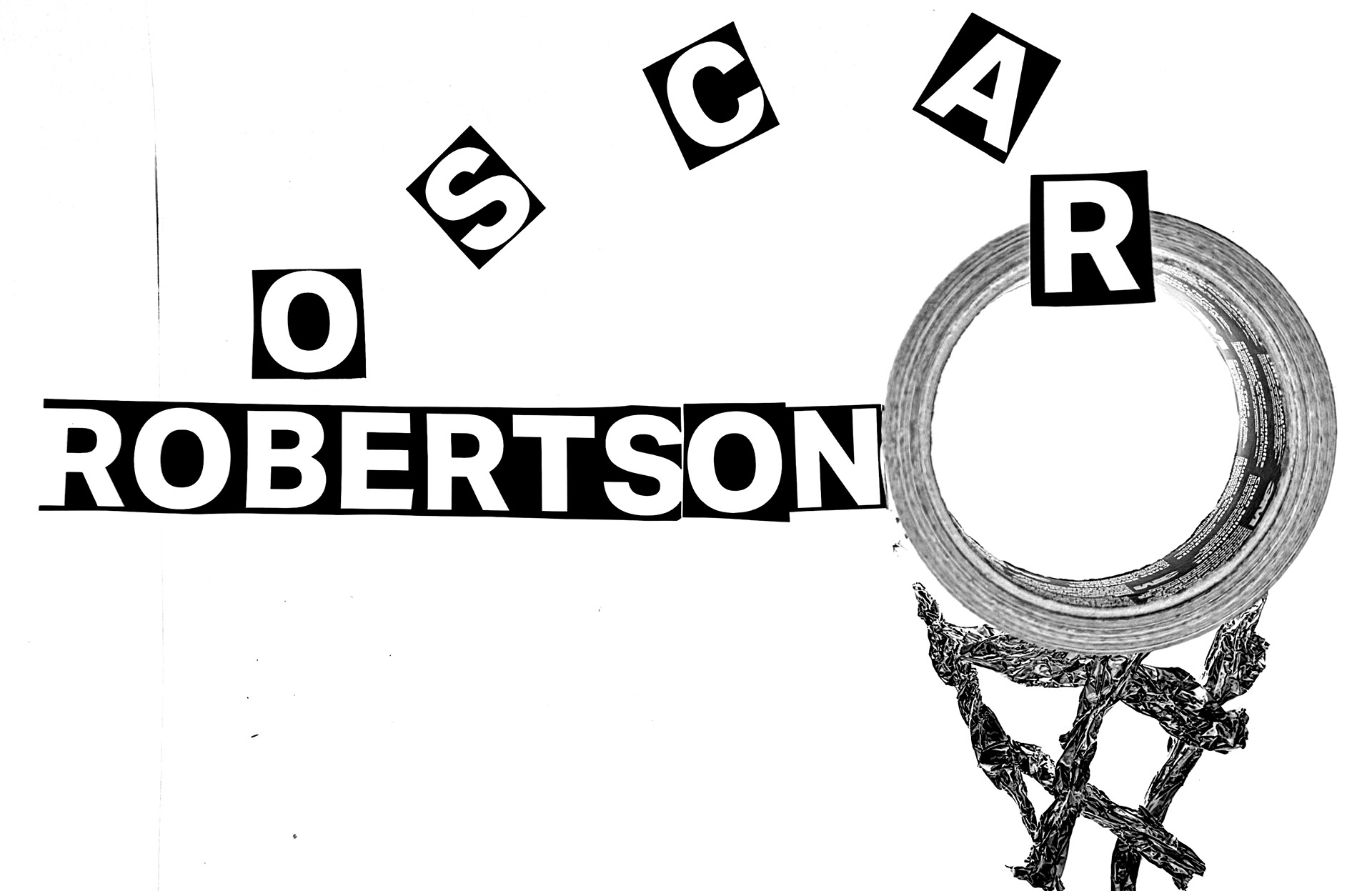
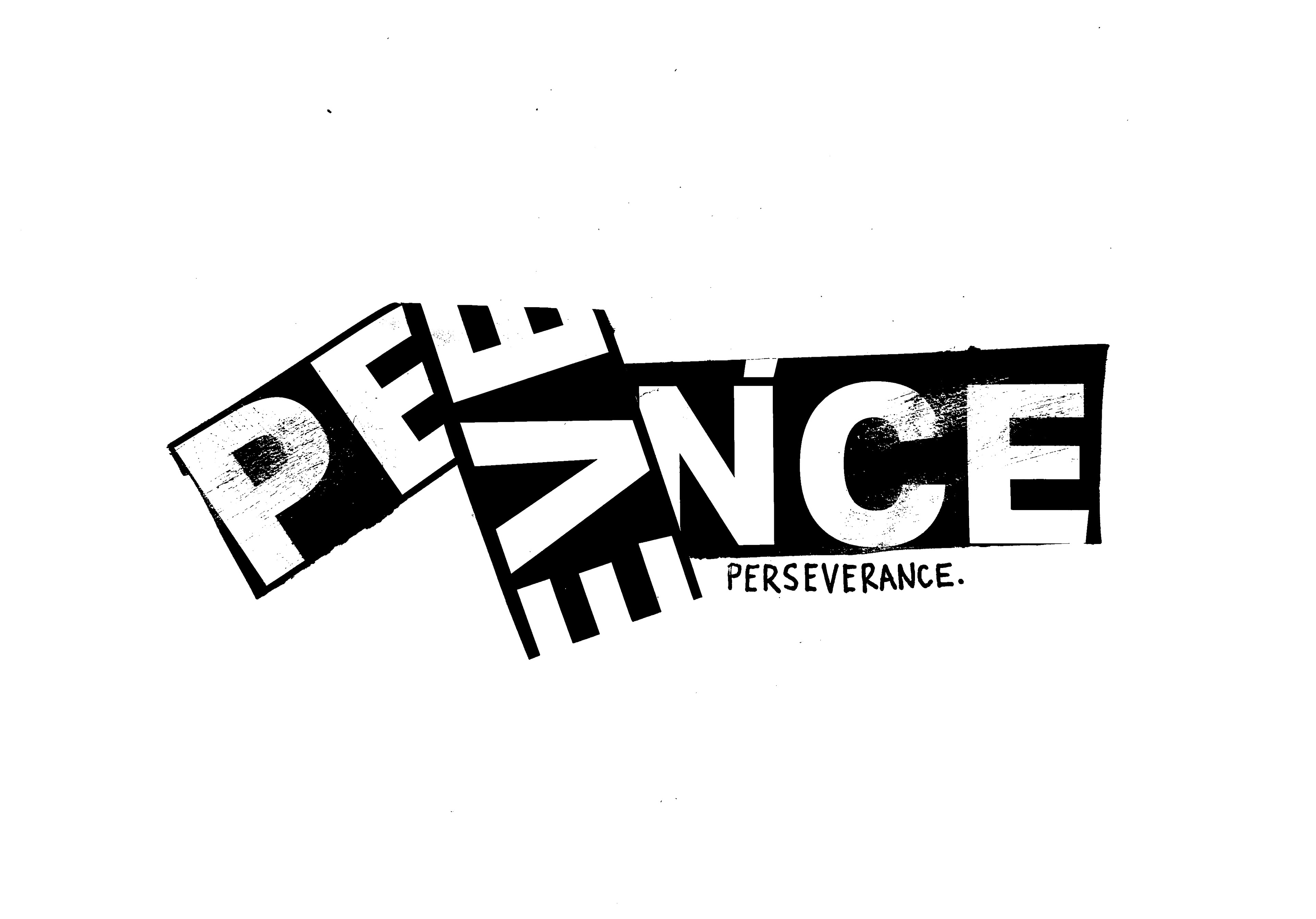
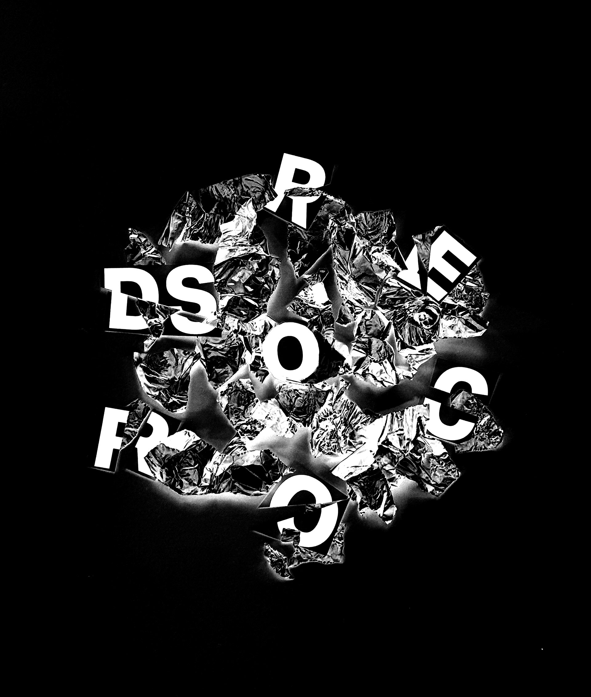

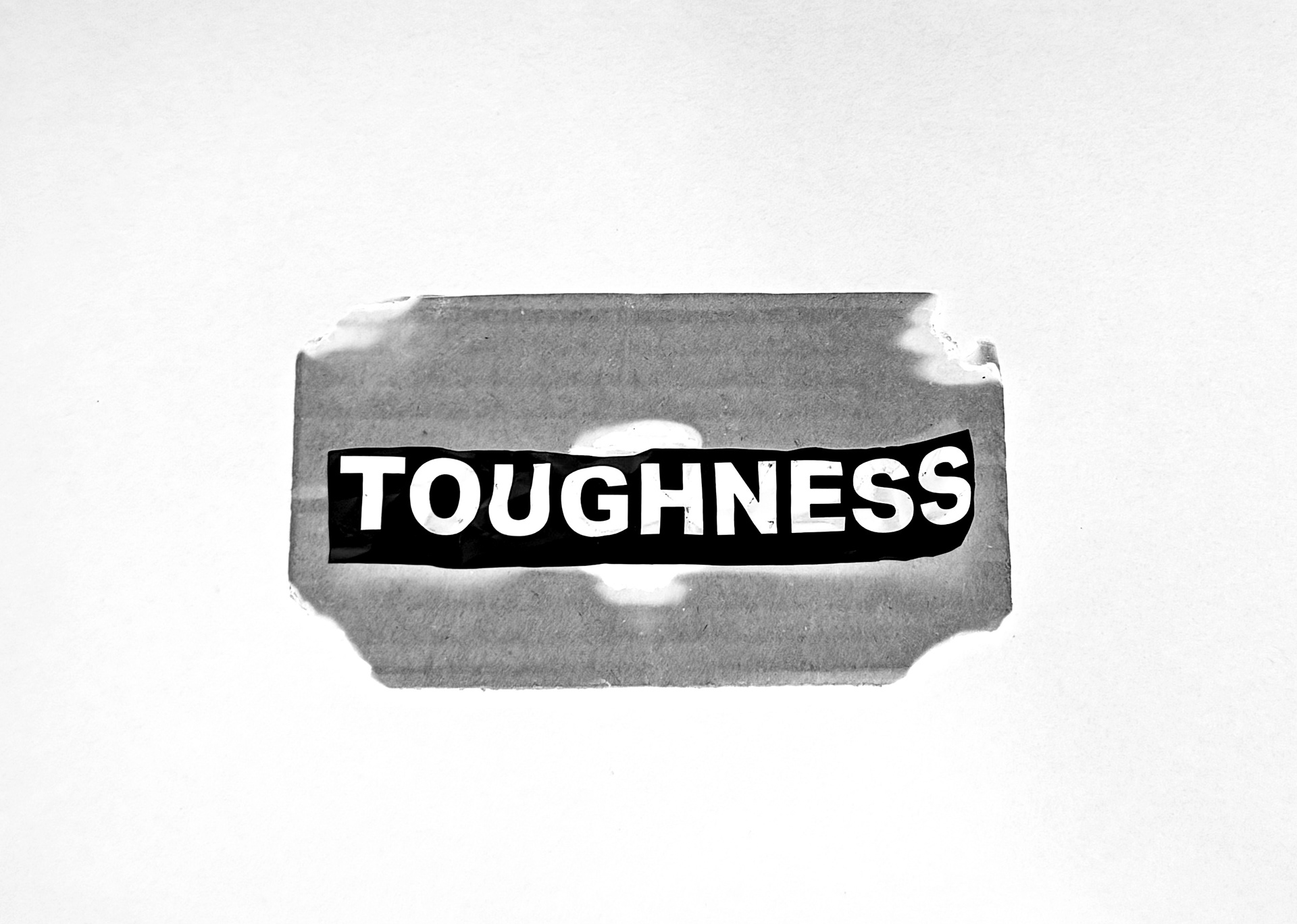

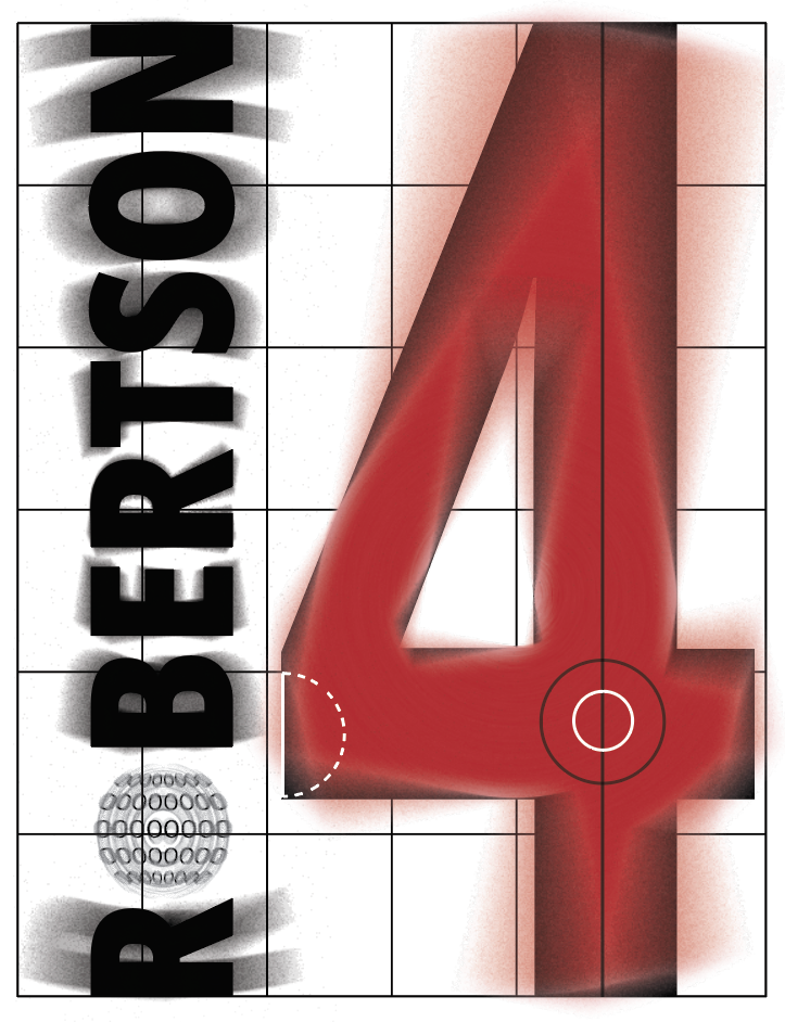
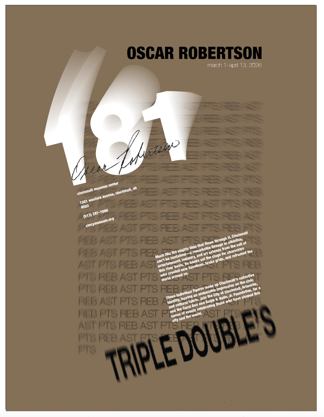
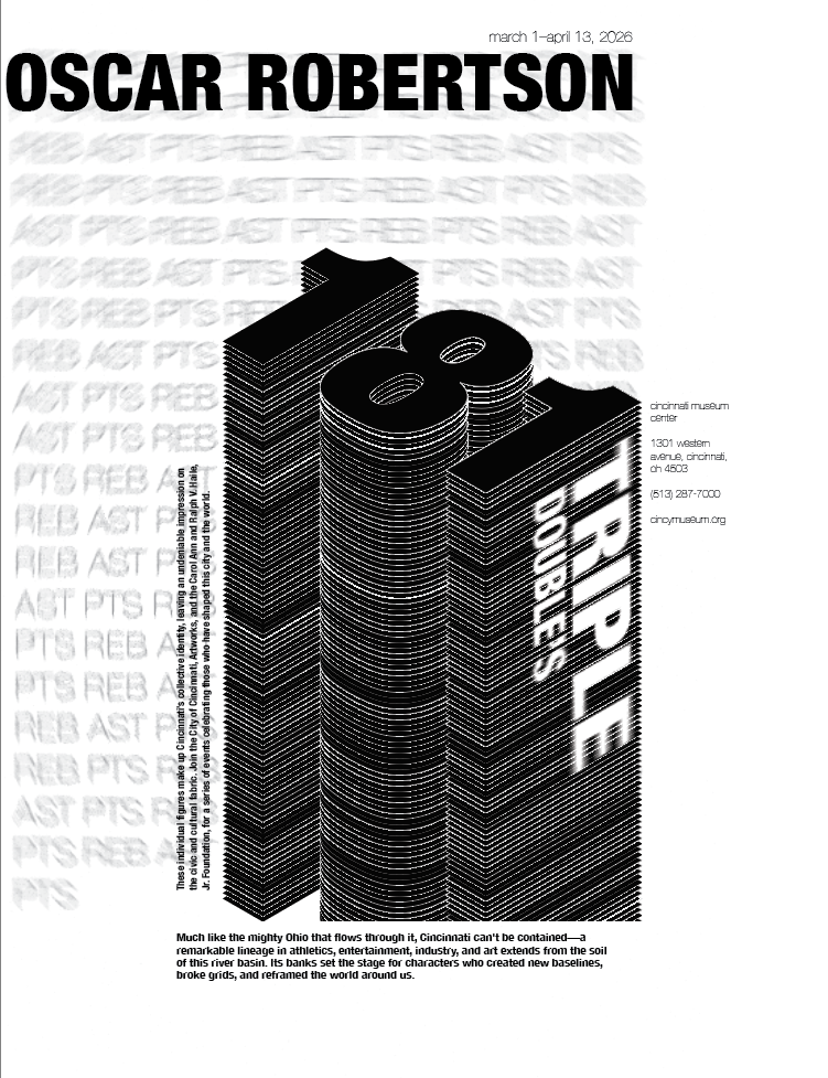
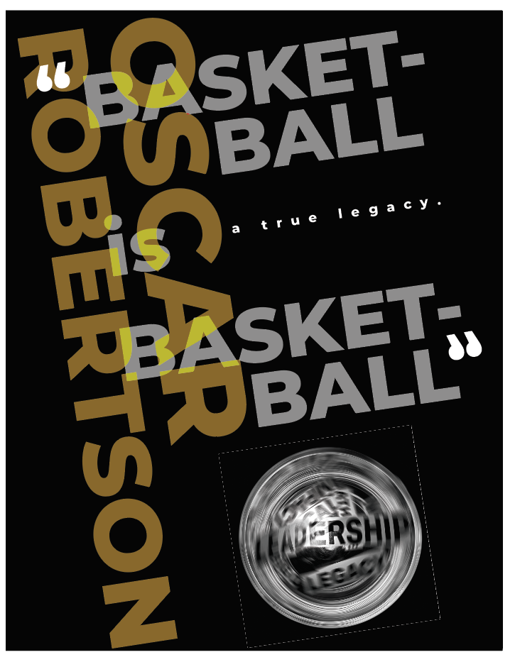
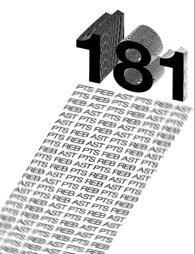
The images below show digital exploratory studies where my concepts from the physical studies were refined and developed into different compositions.
Color + Typography
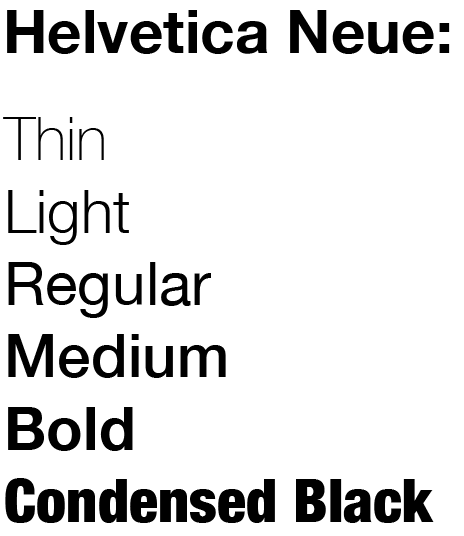
I chose to use Helvetica Neue for its clean, versatile form and strong readability. Since my poster focused on Oscar Robertson and his movement on the court, I experimented with different weights, depth, rotation, 3D effects, and radial blur to express motion and energy. Such attributes helped steer away a flat composition and made it feel more connected to the subject.
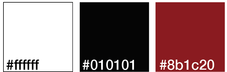
For my color palette, I used black and white as the main source of color to create a visually strong contrast and keep the composition focused. I added red as a subtle accent to bring some color without overwhelming the important parts of the design.
Final Design