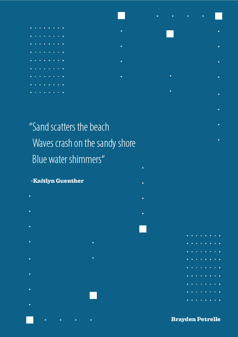
Traditional Haiku Poem

Objective
This project focuses on interpreting a traditional haiku poem through the use of typography, graphic elements, and imagery. My goal was to create a creative, visual sequence that reflects the chosen poem's rhythm, meaning, and mood.
Traditional Haiku Poem choice:
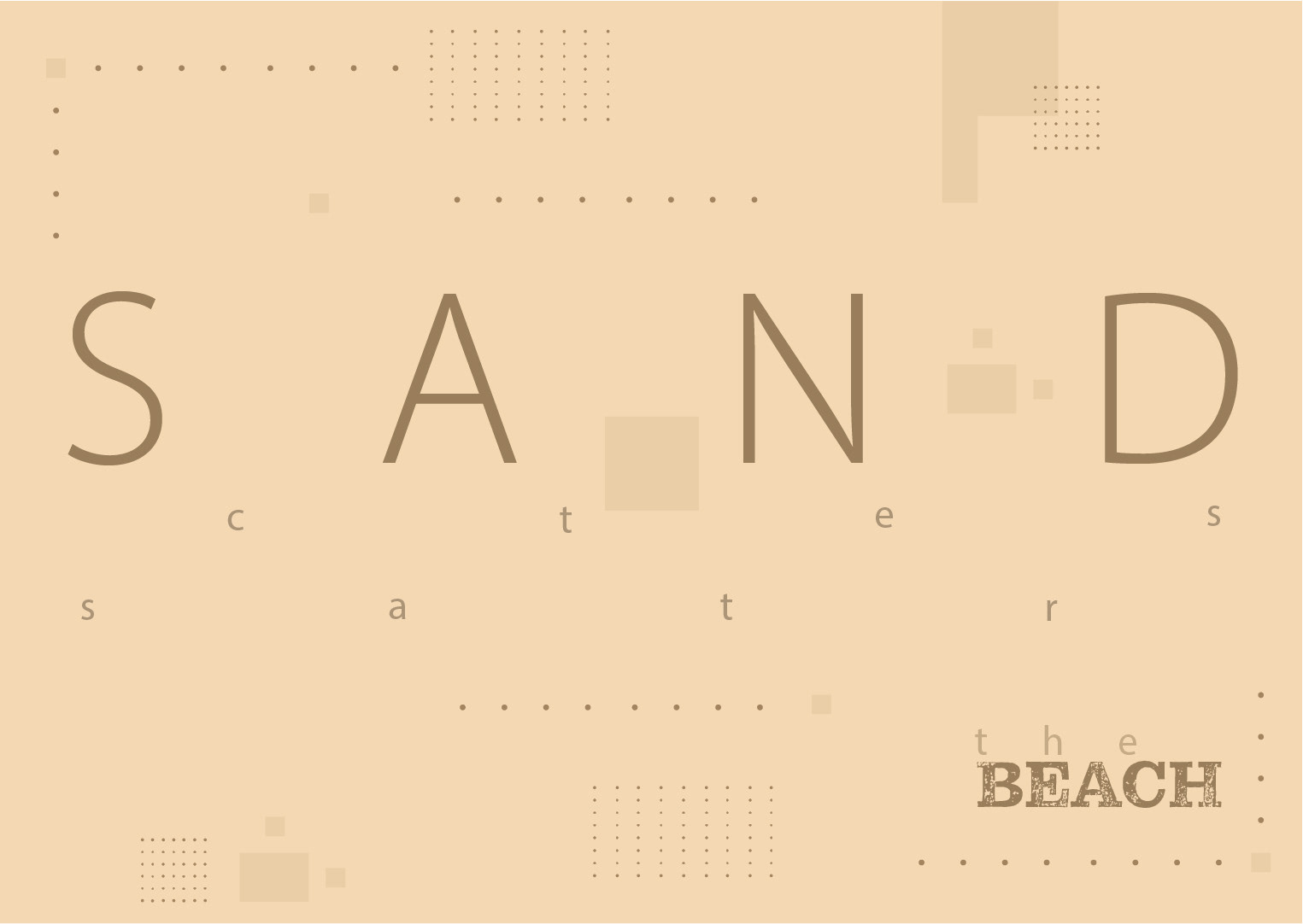
"Sand scatters the beach
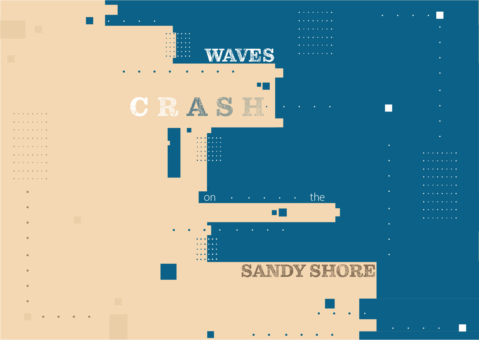
Waves crash on the sandy shore
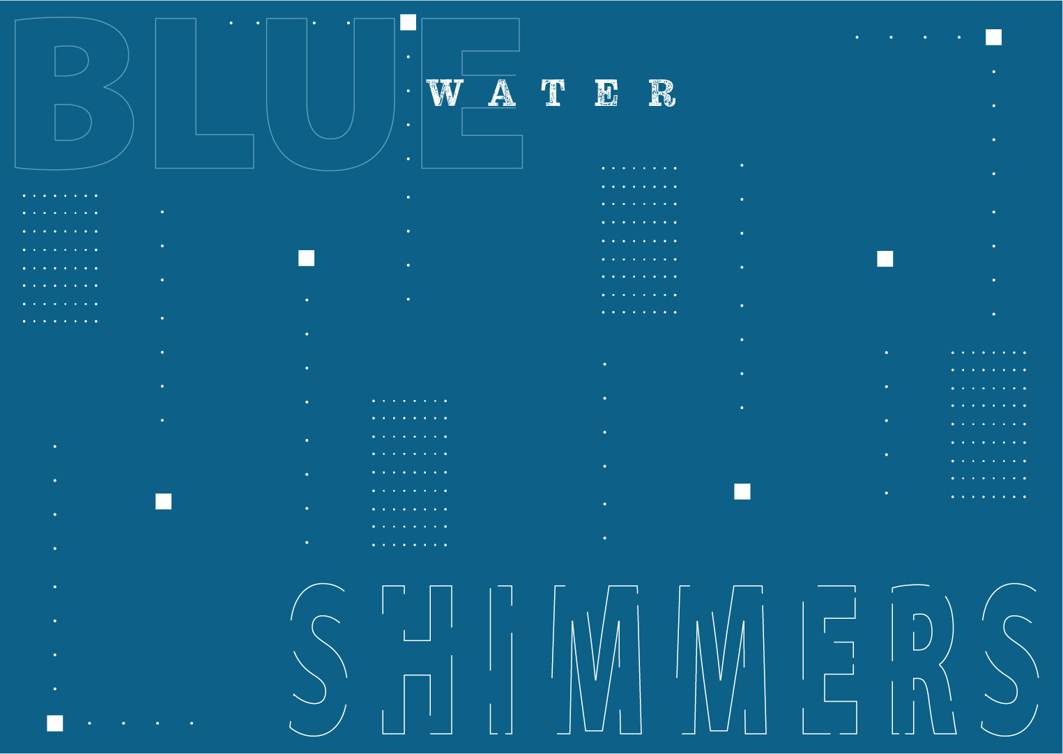
Blue water shimmers "
-Kaitlyn Guenther
Sketches + Brainstorm
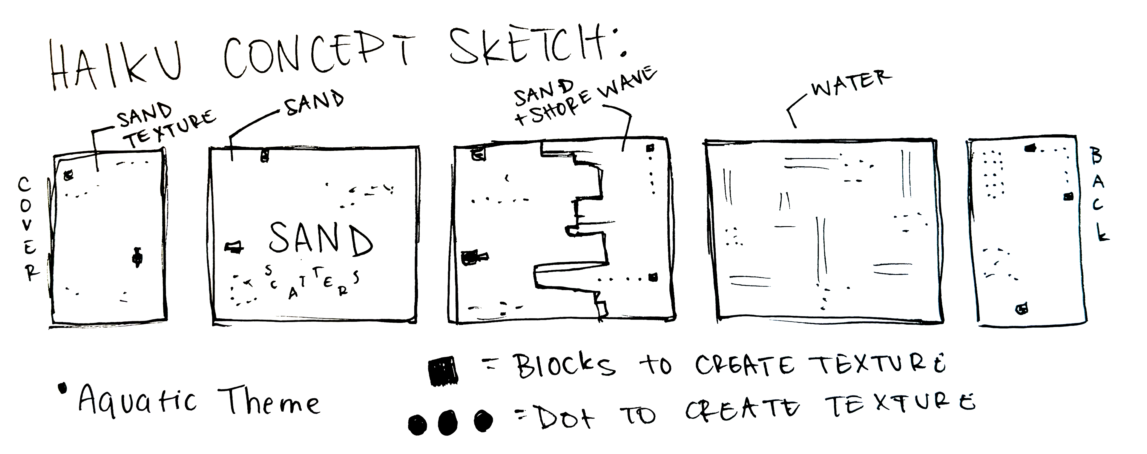
Exploration
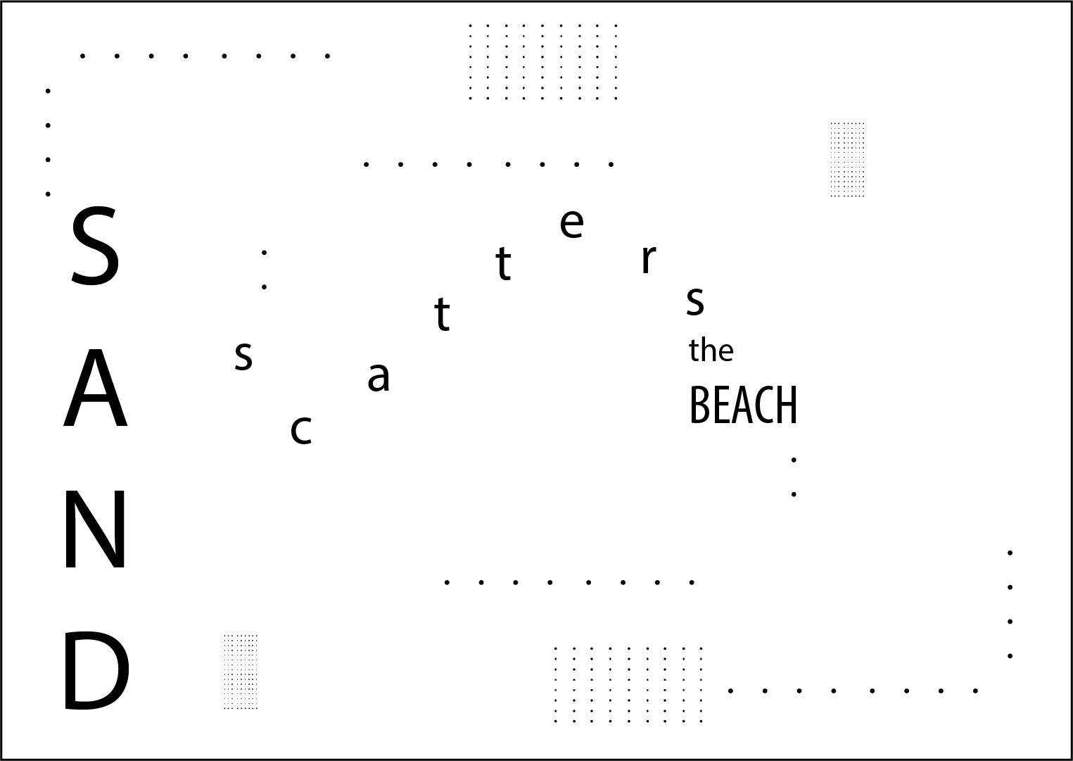
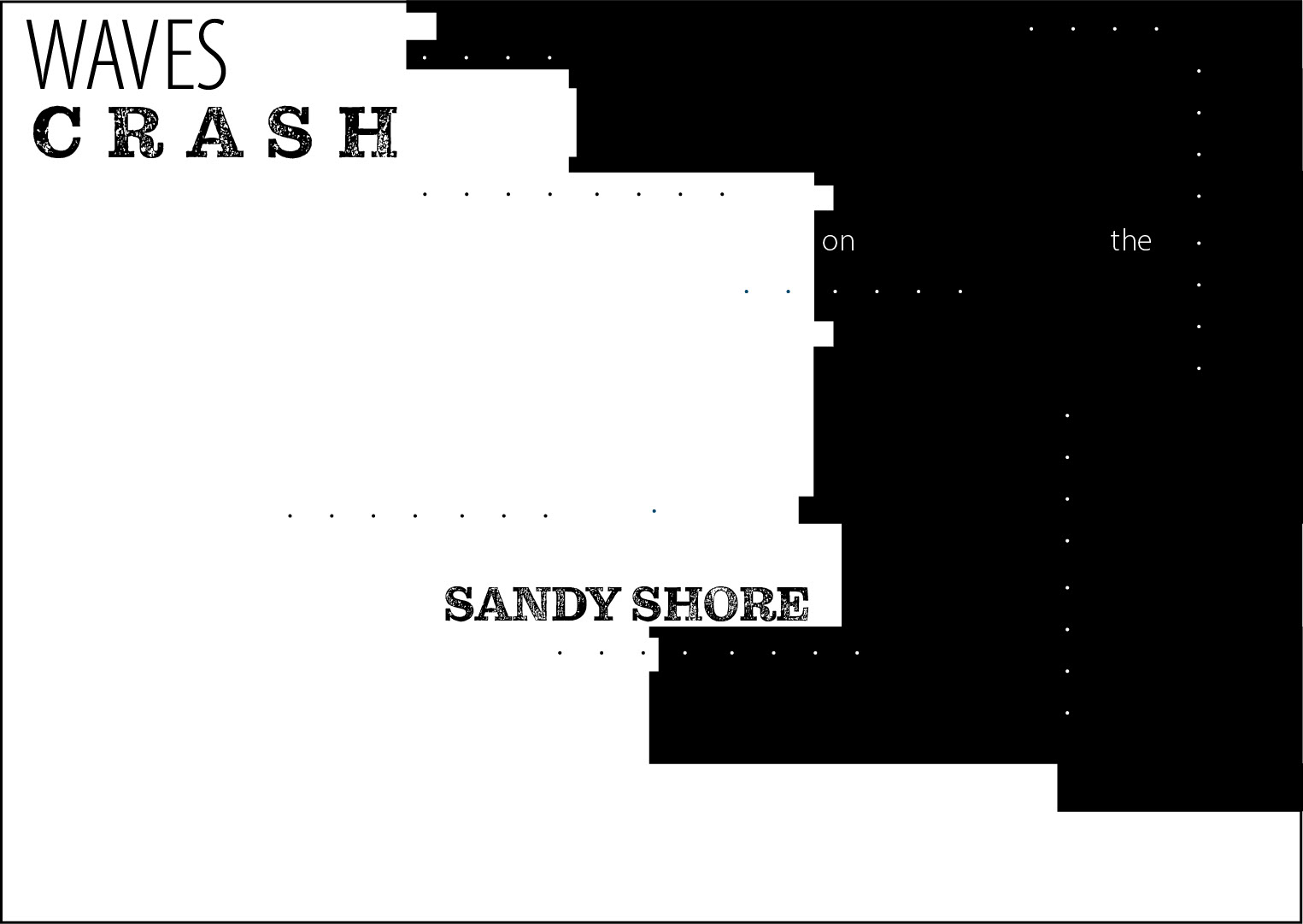
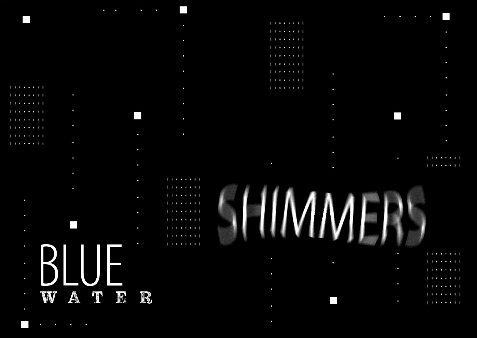
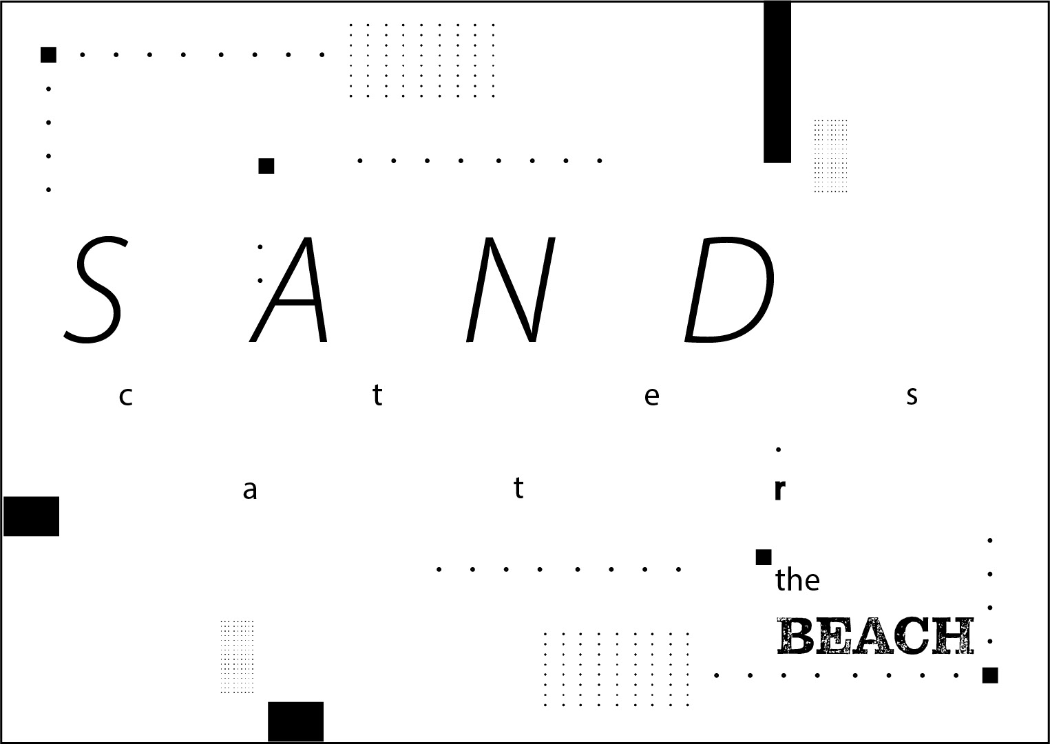
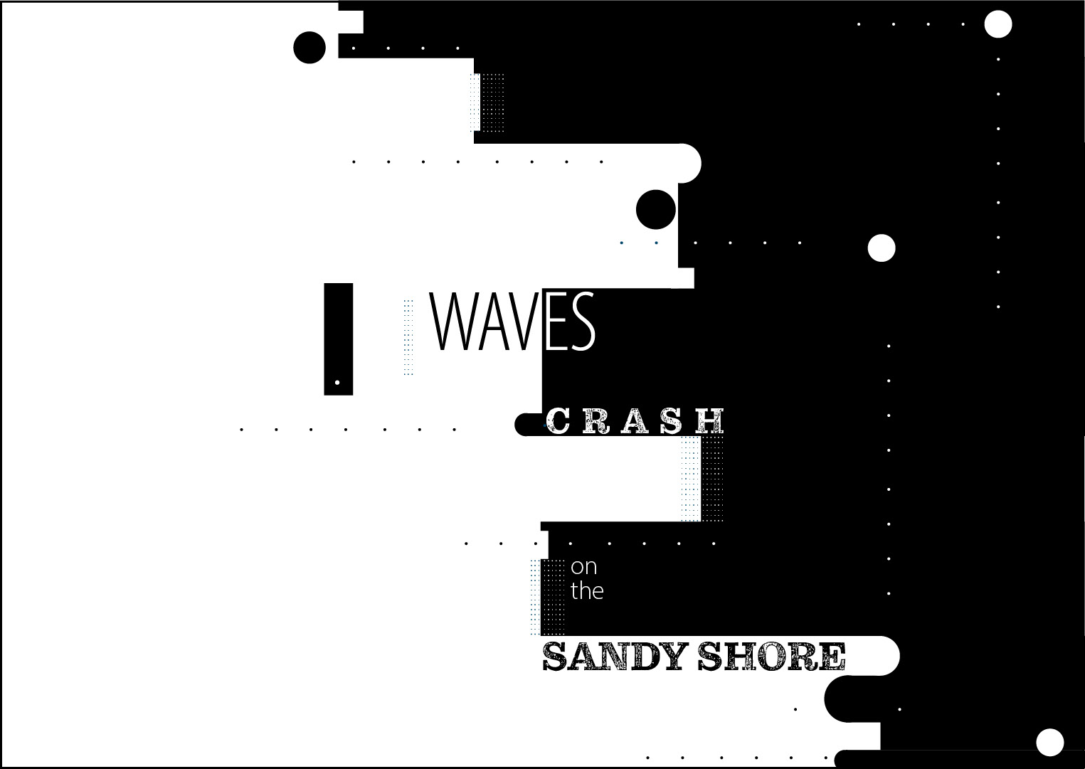
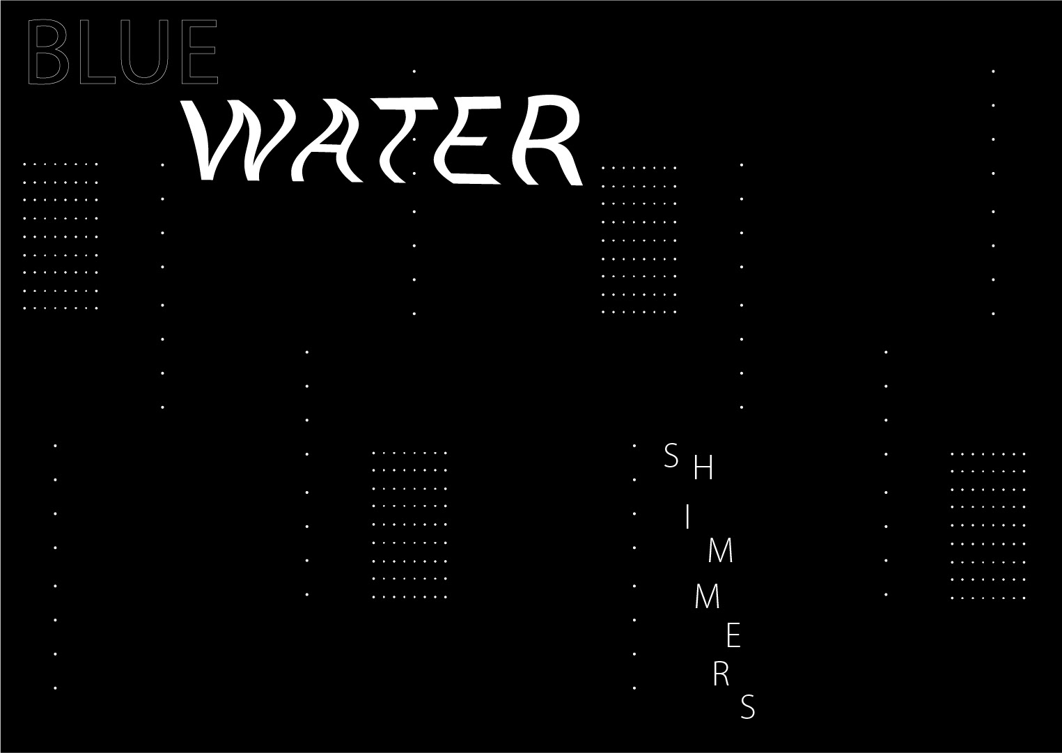
While exploring, I already had a strong visual direction in mind based off my sketches, so my iterations remained relatively consistent in my overall approach. I used many different dots and shapes to build a geometric texture on the sand and water. Also, creating the sequence to feel like the reader was gradually moving from the sandy beach toward the water as they progressed through each page.
Color + Typography
For the typography, I wanted to create a clean, readable look with the slightly basic Myriad Pro, while Pulpo Rust added a more textured, water-like effect to follow my ocean theme.
I also experimented with opacity, positioning, and cutting the text to create movement and layered visuals.

For color, I used a range of tan and brown shades to represent the sand, contrasted with shades of blue to represent the water. Implementing these colors into the several little geometric shapes created for texture.

Final Haiku Design